# Ruby Native full documentation
> Turn your Rails app into iOS and Android apps. Any frontend framework. No Xcode or Android Studio required.
--------------------------------------------------------------------------------
Page: Documentation
URL: https://rubynative.com/docs
--------------------------------------------------------------------------------
# Documentation
Learn how to get the most out of Ruby Native. These guides cover common features you can add after your first preview.
Try Ruby Native →
## Getting started
- [Setup](/docs/setup) - configure your app and layout
- [Tabs](/docs/tabs) - tab bar, eager loading, and tab routing
- [Icons](/docs/icons) - SF Symbols on iOS and Material Symbols on Android
- [Navigation bar](/docs/navbar) - native navbar with buttons, menus, and submit buttons
- [Form handling](/docs/forms) - skip form pages when navigating back
- [Inertia (React & Vue)](/docs/inertia) - setup for apps using React or Vue instead of ERB
## More features
- [Appearance](/docs/appearance) - colors, dark mode, edge-to-edge content, and landscape orientation
- [Error screen](/docs/error-screen) - customize and translate the offline and error fallback screens
- [Authentication](/docs/authentication) - keep sessions alive for native users
- [OAuth](/docs/oauth) - sign in with Google, GitHub, and other providers
- [Linked domains](/docs/linked-domains) - tap-to-open in app and password autofill (iOS)
- [Back buttons](/docs/back-buttons) - add native back navigation with a single CSS class
- [Root pages](/docs/root-pages) - land a page with nothing behind it and no back button
- [Floating action button](/docs/fab) - native FAB above the tab bar
- [Barcode scanner](/docs/barcode-scanner) - scan QR codes and barcodes with the device camera
- [Haptics](/docs/haptics) - trigger device vibrations on user interaction
- [Push notifications](/docs/push-notifications) - request permission, register tokens, and send notifications
- [Badges](/docs/badges) - update app icon and tab bar badges from page loads
- [In-app review](/docs/review) - ask for an App Store or Google Play rating in-app
- [In-app purchases](/docs/in-app-purchases) - sell subscriptions through StoreKit
- [Permissions](/docs/permissions) - camera, photo library, and microphone access
- [Screenshots](/docs/screenshots) - capture phone screenshots for both stores from one flow
- [CLI](/docs/cli) - deploy builds and auto-deploy from CI
## Native screen transitions
Want push/pop animations and swipe-to-go-back between screens? [Advanced Mode](/docs/advanced-mode) adds native navigation transitions on top of everything above. No extra JavaScript or dependencies, just a one-line change in `config/ruby_native.yml`.
## iOS
The [iOS guides](/docs/ios) cover enrolling in the Apple Developer Program, setting up App Store Connect, and submitting your app to the App Store.
## Android
The [Android guides](/docs/android) cover creating your Google Play Developer account, internal testing, and promoting to the production Play Store.
--------------------------------------------------------------------------------
Page: Setup
URL: https://rubynative.com/docs/setup
--------------------------------------------------------------------------------
# Setup
## Installation
Add the gem to your Gemfile and run the install generator:
```sh
bundle add ruby_native
rails generate ruby_native:install
```
The generator creates `config/ruby_native.yml` and prints instructions for updating your layout.
## Tabs
Define your tab bar in `config/ruby_native.yml` with a title, path, and [icon](/docs/icons) for each tab.
```yaml
tabs:
- title: Home
path: /
icon: house
- title: Profile
path: /profile
icon: person
```
See the [tabs guide](/docs/tabs) for eager loading, tab routing, and the `auto_route` option.
## Entry path
By default the app launches on the first tab's path. Set `entry_path` to override this.
```yaml
app:
entry_path: /inbox
```
If `entry_path` is not set, the app loads the first tab's path, then falls back to `/`.
## Layout
Add `native_tabs_tag` to your layout `` to tell the app when to show the tab bar. Like all Ruby Native helpers, it must render inside the ``, not the ``. See the [tabs guide](/docs/tabs) for React and Vue examples.
```erb
<%= native_tabs_tag if user_signed_in? %>
```
### Stylesheet
Include the gem's stylesheet in your layout ``. This provides utility classes for safe area layout and hides elements marked with `native-hidden`.
```erb
<%= stylesheet_link_tag :ruby_native %>
```
On Sprockets apps, also add `//= link ruby_native.css` to `app/assets/config/manifest.js` or the tag raises an error. Propshaft apps need no extra step.
### Viewport meta tag
Add `viewport-fit=cover` to your viewport meta tag. This is required for CSS `env(safe-area-inset-*)` variables to return real values when the web view extends behind the status bar. Without it they resolve to `0` and the `native-inset` classes silently add no padding, so content hides under the status bar.
```erb
```
### Safe area layout
The web view extends behind the status bar and Dynamic Island. Add the `native-inset` class to your main content wrapper so content clears the status bar at the top and the tab bar at the bottom. It stacks with your existing padding.
```erb
<%= yield %>
```
Use `native-inset-top` or `native-inset-bottom` if you only need one side. See the [appearance guide](/docs/appearance) for details and fixed navbar handling.
### Hide web-only UI
Use `native_app?` to hide elements that the native app replaces, like a web navbar or footer.
```erb
<%= render "navbar" unless native_app? %>
<%= render "footer" unless native_app? %>
```
### Check the native library version
Use `native_version` to show or hide content based on the Ruby Native library version the app was built with, like a feature that needs a newer native shell. It returns `"0"` when the version is unknown and supports string comparisons. For the app's own version, use `native_app_version` below.
```erb
<% if native_version >= "0.13" %>
<%# Show features that require the 0.13 native shell %>
<% end %>
```
### Read app and device details
Three more helpers expose what the app reports about itself and the device. Each returns a string for native requests and `nil` for web browsers.
```erb
<%= native_app_version %> <%# "5.2", the app's marketing version %>
<%= native_app_build %> <%# "35", the build number %>
<%= native_os_version %> <%# "26.5.2", the iOS or Android version %>
```
`native_app_build` and `native_os_version` also return `nil` for app builds from before the User-Agent carried them.
## Next steps
- [Tabs](/docs/tabs) - eager loading, tab routing, and the `auto_route` option
- [Navigation bar](/docs/navbar) - add a native navbar with buttons and menus
- [Appearance](/docs/appearance) - customize colors, dark mode, and edge-to-edge content
- [Inertia (React & Vue)](/docs/inertia) - setup for apps using React or Vue instead of ERB
--------------------------------------------------------------------------------
Page: Tabs
URL: https://rubynative.com/docs/tabs
--------------------------------------------------------------------------------
# Tabs
Define your tab bar in `config/ruby_native.yml` with a title, path, and [icon](/docs/icons) for each tab.
```yaml
tabs:
- title: Home
path: /
icon: house
- title: Profile
path: /profile
icon: person
```
You may also omit `tabs` to hide the tab bar entirely. The app will load [`entry_path`](/docs/setup#entry-path) or fall back to `/`.
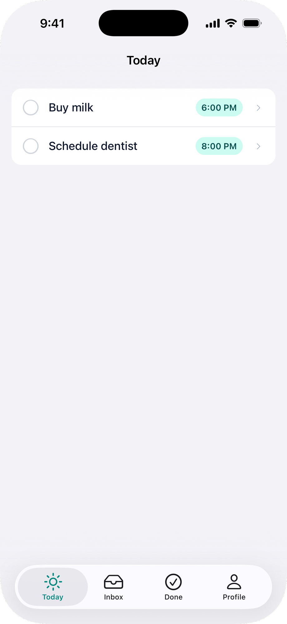
## Showing and hiding the tab bar
Add `native_tabs_tag` to your layout to tell the app when to show the tab bar.
**ERB:**
```erb
<%= native_tabs_tag if user_signed_in? %>
```
Pass `enabled: false` to dynamically hide the tab bar, for example during edit mode:
```erb
<%= native_tabs_tag(enabled: !@editing) %>
```
**React:**
```jsx
import { NativeTabs } from "@ruby-native/react"
export default function Layout({ children }) {
const { currentUser } = usePage().props
return (
<>
{currentUser && }
{children}
)
}
```
Pass `enabled={false}` to dynamically hide the tab bar, for example during edit mode:
```jsx
```
**Vue:**
```vue
```
Pass `:enabled="false"` to dynamically hide the tab bar, for example during edit mode:
```vue
```
## Eager loading
By default, each tab's content loads when the user first taps it. To load a tab immediately when the tab bar appears, set `eager: true`:
```yaml
tabs:
- title: Home
path: /
icon: house
- title: Profile
path: /profile
icon: person
eager: true
```
The first tab always loads immediately (it is the visible tab). Use `eager` on other tabs that benefit from being ready when the user switches to them.
## Search tab
Mark your app's search screen with `search: true`:
```yaml
tabs:
- title: Home
path: /
icon: house
- title: Search
path: /search
icon: magnifyingglass
search: true
```
iOS gives the tab the system search treatment: it sits apart from the other tabs with the search appearance, and tapping it loads the tab's `path` like any other tab.
This currently applies on iOS in [Advanced Mode](/docs/advanced-mode) only. Normal Mode and Android read the option and ignore it, so it is safe to keep in your config while support catches up.
## Tab routing
When a user clicks a link that belongs to a different tab, the app automatically switches to that tab. This works with Turbo, Inertia, and plain HTML links for GET requests. Form submissions (POST, PUT, DELETE) always stay in the current tab, and server-side redirects are not intercepted.
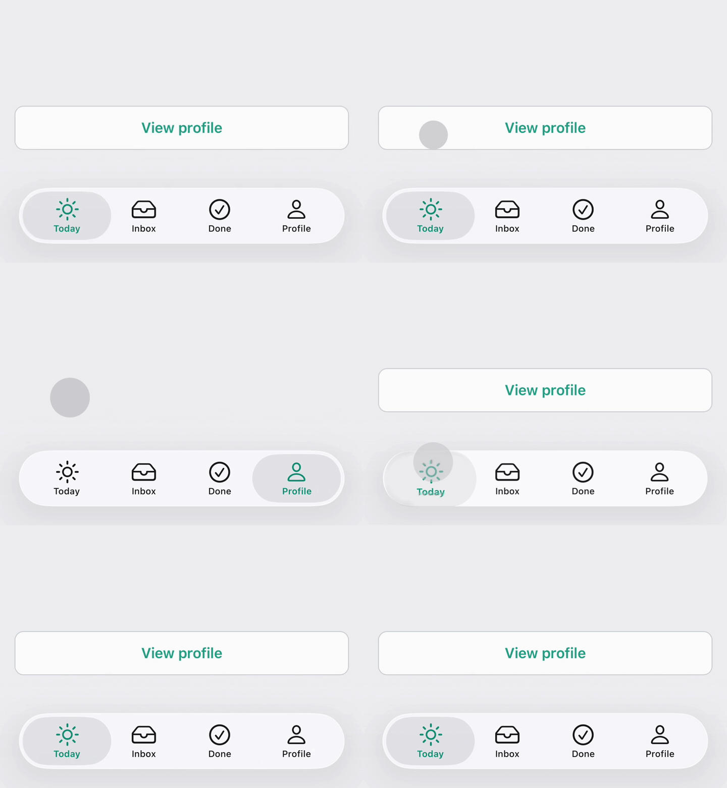
By default, each tab matches URLs that start with its `path`. A tab with `path: /inbox` matches `/inbox`, `/inbox/123`, `/inbox/archive`, etc.
### Disabling routing
Set `auto_route: false` to disable routing for a tab entirely.
```yaml
tabs:
- title: Home
path: /
icon: house
auto_route: false
- title: Inbox
path: /inbox
icon: tray
- title: Profile
path: /profile
icon: person
```
### Custom route prefixes
For more control, set `auto_route` to an array of route prefixes. This replaces the default prefix match on `path`.
```yaml
tabs:
- title: Explore
path: /explore
icon: binoculars
auto_route:
- /explore
- /breweries/
- /neighborhoods/
- title: Passport
path: /passport
icon: wallet.bifold
```
A trailing slash means "only match sub-paths." `/breweries/` matches `/breweries/123` but not `/breweries`. Without the trailing slash, both would match.
When multiple tabs match a URL, the longest prefix wins. If no tab matches, the link navigates within the current tab as usual.
### JavaScript API
`RubyNative.visit()` is tab-aware. Call it to navigate to any URL and the app will switch tabs if needed.
```js
RubyNative.visit("/inbox/123") // switches to Inbox tab and navigates
RubyNative.visit("/profile") // switches to Profile tab
```
If the URL matches the current tab (or no tab at all), it navigates locally using Turbo, Inertia, or a standard page load.
--------------------------------------------------------------------------------
Page: Icons
URL: https://rubynative.com/docs/icons
--------------------------------------------------------------------------------
# Icons
Ruby Native uses native icon libraries for tab bar and button icons: [SF Symbols](https://developer.apple.com/sf-symbols/) on iOS and [Material Symbols](https://fonts.google.com/icons) on Android. Think of either as Font Awesome or Heroicons, but built into the platform.
## Setting an icon
In your `config/ruby_native.yml`, set the `icon` for each tab. When the iOS and Android names match (most common icons), one value works for both.
```yaml
tabs:
- title: Home
path: /
icon: home
- title: Profile
path: /profile
icon: person
```
When the names differ, use the `icons:` hash and give both platforms a name. Drop `icon:` when you do; it's the fallback for when one name covers both, not something `icons:` needs alongside it.
```yaml
tabs:
- title: New
path: /new
icons:
ios: plus
android: add
```
## Cross-platform names
The most popular choices for typical app navigation:
| iOS (SF Symbol) | Android (Material Symbol) | Good for |
|---|---|---|
| `house` | `home` | Home, dashboard |
| `magnifyingglass` | `search` | Search |
| `plus` | `add` | Create, new item |
| `person` | `person` | Profile, account |
| `envelope` | `mail` | Messages, inbox |
| `bell` | `notifications` | Notifications |
| `gear` | `settings` | Settings |
| `star` | `star` | Favorites, bookmarks |
| `shippingbox` | `inventory_2` | Orders, packages |
| `link` | `link` | Links, connections |
| `building.2` | `business` | Company, organization |
| `calendar` | `calendar_today` | Events, schedule |
## iOS (SF Symbols)
Apple's built-in icon library. Names are case-sensitive and use dots as separators (e.g., `person.crop.circle`, not `personCropCircle`).
Apple offers over 6,000 symbols. Two ways to browse them:
- **[SF Symbols app](https://developer.apple.com/sf-symbols/) (Mac only):** Download the free SF Symbols app for a more complete browsing experience with search, categories, and weight previews. This is optional. You don't need a Mac to use SF Symbols with Ruby Native.
- **[On the web](https://github.com/andrewtavis/sf-symbols-online/blob/master/README.md):** View a searchable gallery with names.
## Android (Material Symbols)
Google's icon library, used by Android. Names are lowercase and use underscores as separators (e.g., `calendar_today`, not `calendarToday`).
Google offers thousands of symbols. Browse them at [fonts.google.com/icons](https://fonts.google.com/icons). Copy the name shown beneath the icon and paste it into your config exactly as it appears. That name is the entire value, with no `@drawable/` prefix and no trailing size like `_24`.
## Tips
- **Stick to the outline style.** Tab bars on both platforms use the outline variant by default and switch to the filled version for the active tab. Use `house`, not `house.fill`.
- **Search by concept.** Looking for a "dashboard" icon? Try "chart", "gauge", or "rectangle.grid" on iOS, or "dashboard", "speed", or "view_module" on Android. Naming isn't always obvious.
- **Use the underscore name on Android, not the display name.** "Calendar today" is the display name; `calendar_today` is what goes in the config.
- **A name that doesn't exist renders a placeholder.** Both platforms fall back to a boxed question mark rather than drawing nothing, so a typo looks like a broken icon instead of an invisible button.
- **Test with your tab bar.** Some symbols look great at large sizes but are hard to read at tab bar size. Stick to simple, recognizable shapes.
--------------------------------------------------------------------------------
Page: Navigation bar
URL: https://rubynative.com/docs/navbar
--------------------------------------------------------------------------------
# Navigation bar
You have two options for the navigation bar: a native one provided by Ruby Native, or your own web-based one. We recommend the native navigation bar for most apps. It uses liquid glass styling, includes a back button automatically, and supports buttons, menus, submit buttons, and share buttons.
If you need full control over the navigation bar's layout and design, you can keep your web-based navbar instead. See [using a web navbar](#using-a-web-navbar) below.
To put a centered logo and brand colors on the native bar across the whole app, see [navbar branding](/docs/appearance#navbar-branding).
For Inertia setup, see the [Inertia guide](/docs/inertia) first.
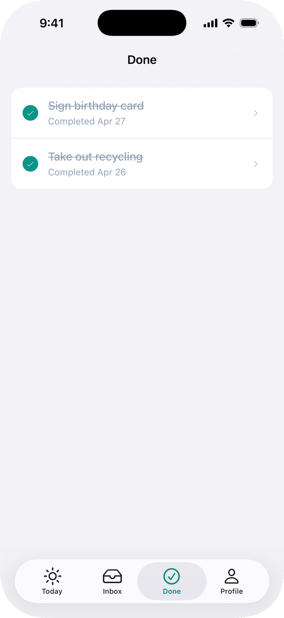
## Native navigation bar
### Basic usage
Add a navbar with a title to each page. Hide your web heading when native so the title isn't duplicated.
**ERB:**
```erb
<%# app/views/categories/index.html.erb %>
<%= native_navbar_tag("Menu") %>
```
## Buttons
Add buttons to the navigation bar. Use `href` to navigate to a URL, or `click` to click a DOM element by CSS selector.
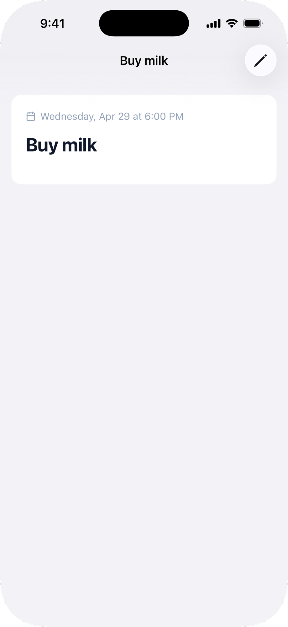
**ERB:**
```erb
<%= native_navbar_tag("Menu") do |navbar| %>
<%= navbar.button icons: { ios: "bag", android: "shopping_bag" }, href: cart_path %>
<% end %>
```
**Inertia:**
```jsx
```
Call the builder with `<%= %>`, not `<% %>`. The methods render nothing on their own, so an output tag keeps inline navbars clean under `erb_lint`, which flags a bare `<% %>` call as an unused expression.
**Button options:**
| Option | Type | Default | Description |
|---|---|---|---|
| `icon` | string | | [icon](/docs/icons) name (e.g., `"bag"`, `"plus"`, `"pencil"`). |
| `icons` | hash | | Per-platform [icons](/docs/icons), e.g. `{ ios: "ellipsis.circle", android: "more_horiz" }`. A match overrides `icon`. |
| `title` | string | | Text label. Use `icon` or `title`, not both. |
| `href` | string | | URL to navigate to when tapped. |
| `click` | string | | CSS selector of a DOM element to `.click()` when tapped. |
| `position` | string | `"trailing"` | `"trailing"` (right), `"leading"` (left), or `"title"` (a dropdown on the title, see [Title menu](#title-menu)). |
| `selected` | boolean | `false` | Renders the button in a selected/highlighted state. |
A leading button shares its slot with the back button, and the back button wins: the leading button shows on screens with nothing to go back to, like a tab's root. Put actions that should stay reachable everywhere in `trailing`.
## Menus
A button with children creates a dropdown menu. Each menu item uses `href` to navigate or `click` to click a DOM element.
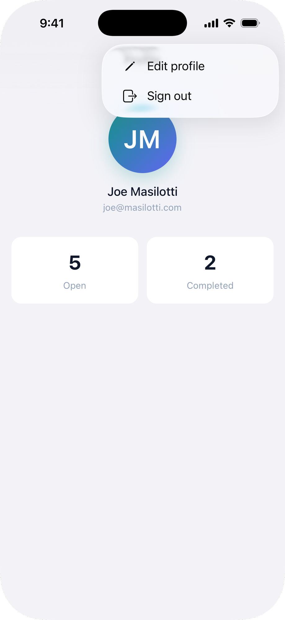
**ERB:**
```erb
<%= native_navbar_tag("Account") do |navbar| %>
<%= navbar.button icons: { ios: "ellipsis.circle", android: "more_horiz" }, position: :leading do |menu| %>
<%= menu.item "Edit profile", href: edit_account_path, icons: { ios: "pencil", android: "edit" } %>
<%= menu.item "Sign out", click: "#sign-out-button", icons: { ios: "rectangle.portrait.and.arrow.right", android: "logout" } %>
<% end %>
<% end %>
<%# Keep the web element in the DOM so the native menu can click it %>
<%= button_to "Sign out", session_path, method: :delete, id: "sign-out-button", class: "native-hidden ..." %>
```
**Inertia:**
```jsx
{/* Keep the web element in the DOM so the native menu can click it */}
```
**Menu item options:**
| Option | Type | Description |
|---|---|---|
| `title` | string | The label shown in the action sheet. |
| `href` | string | URL to navigate to when selected. |
| `click` | string | CSS selector of a DOM element to `.click()` when selected. |
| `icon` | string | Optional [icon](/docs/icons) name shown next to the title. |
| `icons` | hash | Per-platform [icons](/docs/icons), e.g. `{ ios: "pencil", android: "edit" }`. A match overrides `icon`. |
| `selected` | boolean | Renders a checkmark next to the item. |
## Title menu
Turn the title itself into a dropdown menu with `position: :title`. Tapping the title opens the menu, and the selected item shows a checkmark. It's the native counterpart of SwiftUI's `toolbarTitleMenu`, and unlike [segments](#segments) it works on both platforms and holds more than a handful of options, so it fits a sort or filter switcher well.
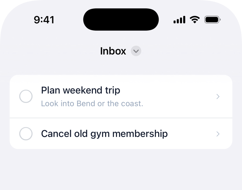
Give the button a `menu` and `position: :title`, with no icon or label of its own. Keep a title on `native_navbar_tag` and it stays as the label beside a dropdown chevron; omit the title and the selected item's text becomes the label. Pair the items with `action: :replace` so switching doesn't stack the back button, the same as segments.
**ERB:**
```erb
<%= native_navbar_tag("Inbox") do |navbar| %>
<%= navbar.button position: :title do |menu| %>
<%= menu.item "Sort by due date", href: inbox_path(sort: "due"), action: :replace, icon: "calendar", selected: @sort == "due" %>
<%= menu.item "Sort by created", href: inbox_path(sort: "created"), action: :replace, icon: "clock", selected: @sort == "created" %>
<% end %>
<% end %>
```
**Inertia:**
```jsx
```
The items take the same [menu item options](#menus) as any navbar menu. A [navbar logo](/docs/appearance#navbar-branding) owns the center of the bar, so when one is configured the title menu, like segments, doesn't render.
## Segments
Show up to three segmented buttons at the top of the screen to switch between closely related pages. For your app's primary sections, use the bottom [tab bar](/docs/tabs) instead.
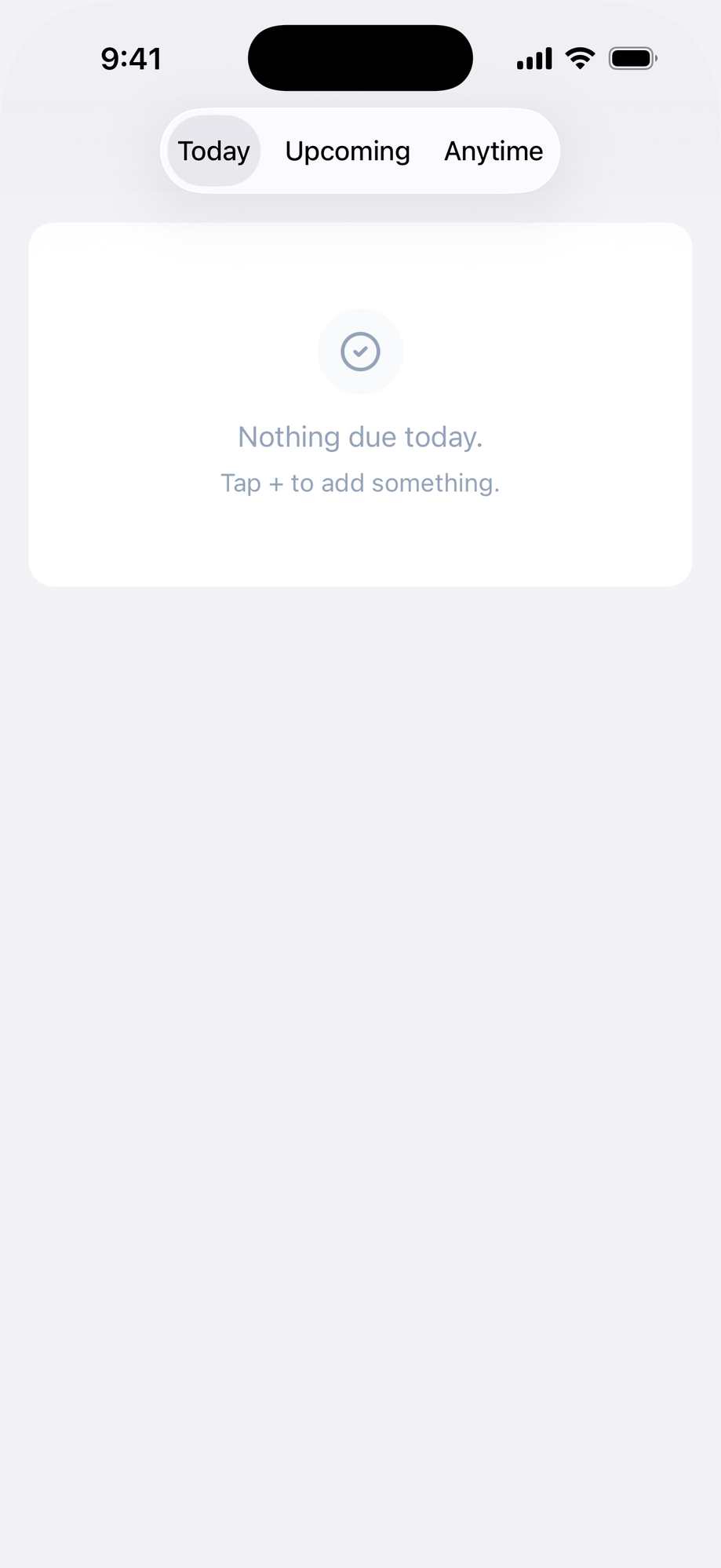
**ERB:**
```erb
<%= native_navbar_tag do |navbar| %>
<%= navbar.segment "Pledges", href: pledges_path, selected: true %>
<%= navbar.segment "Digital Rewards", href: digital_rewards_path %>
<% end %>
```
**Inertia:**
```jsx
```
Mark the current page's segment `selected`, and render the same set on each sibling page so the control stays in place as the user moves between them. Switching segments replaces the current history entry instead of stacking it, so the back button doesn't step back through segment switches.
**Segment options:**
| Option | Type | Default | Description |
|---|---|---|---|
| `title` | string | | The segment label. First positional argument. |
| `href` | string | | URL to navigate to when tapped. |
| `click` | string | | CSS selector of a DOM element to `.click()` when tapped, instead of `href`. |
| `selected` | boolean | `false` | Marks the current page's segment. |
Segments and a [navbar logo](/docs/appearance#navbar-branding) both occupy the center of the bar, so when a logo is configured the segments don't render.
## Submit buttons
Add a native submit button that clicks the web form's submit button. The native button mirrors the web button's disabled state automatically, so it disables during form submission and re-enables when done.
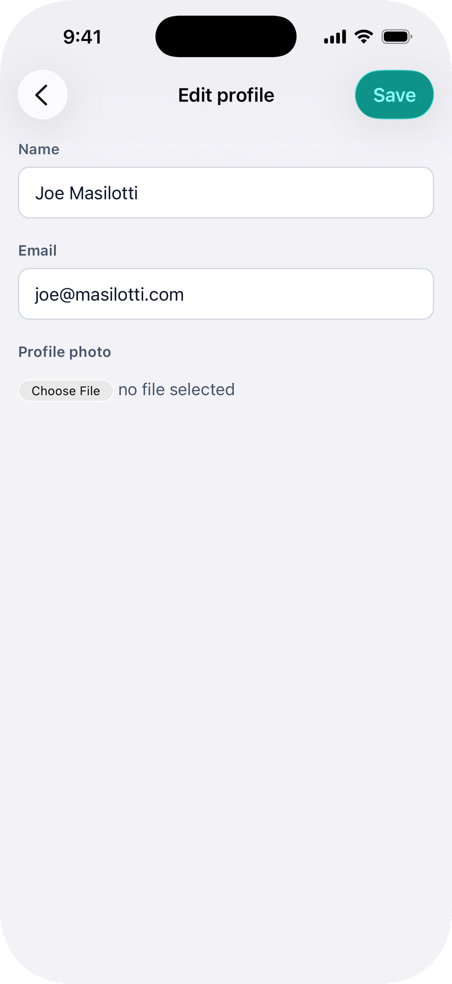
Keep the web submit button in the DOM (use the `native-hidden` class) so the native button can click it.
**ERB:**
```erb
<%# app/views/accounts/edit.html.erb %>
<%= native_form_tag %>
<%= native_navbar_tag("Edit profile") do |navbar| %>
<%= navbar.submit_button title: "Save" %>
<% end %>
```
**React:**
```jsx
import { NativeNavbar, NativeSubmitButton } from "@ruby-native/react"
export default function Edit() {
return (
<>
)
}
```
**Vue:**
```vue
```
**Submit button options:**
| Option | Type | Default | Description |
|---|---|---|---|
| `title` | string | `"Save"` | The button label in the navigation bar. |
| `click` | string | `"[type='submit']"` | CSS selector for the web submit button to click. |
## Share buttons
Add a button that opens the native share sheet. By default it shares the current page. Pass `url` to share a different link, and customize the label, icon, and position like any other navbar button.
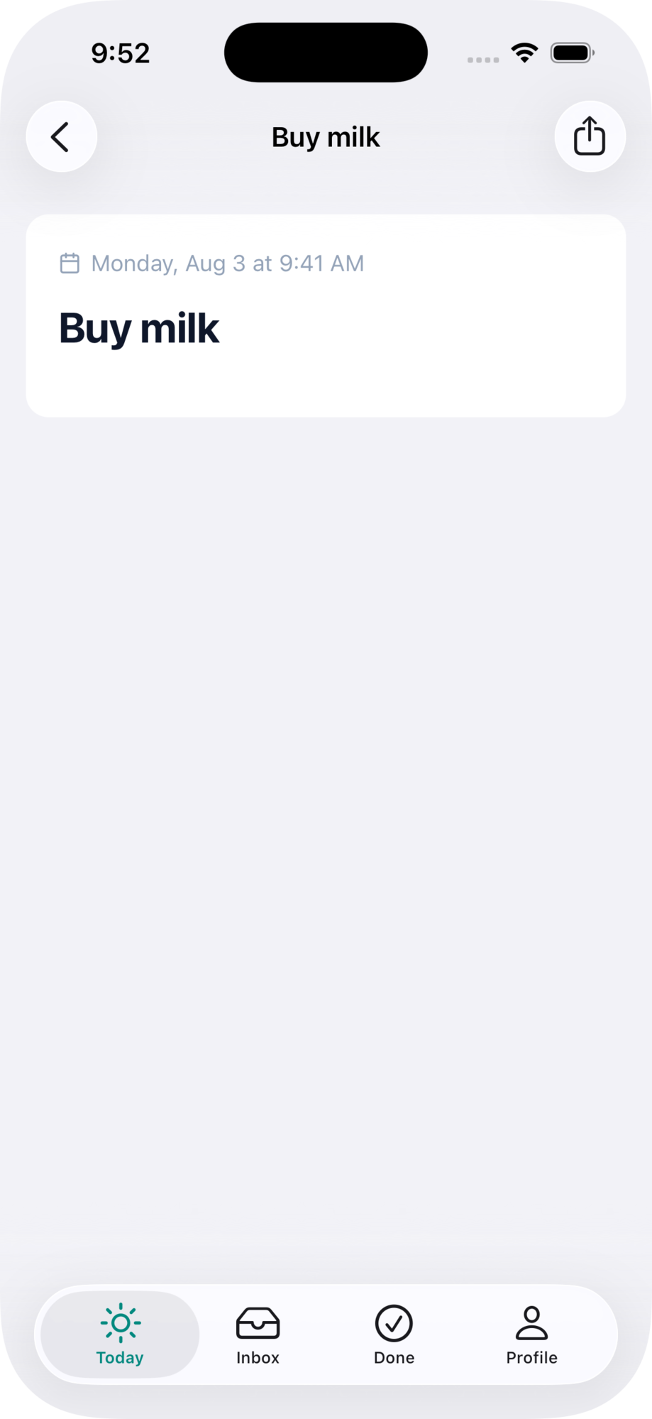
**ERB:**
```erb
<%= native_navbar_tag("Brewery") do |navbar| %>
<%# Shares the current page %>
<%= navbar.share_button %>
<%# Or customize everything %>
<%= navbar.share_button url: brewery_url(@brewery),
title: "Send",
icons: { ios: "square.and.arrow.up.circle", android: "share" },
position: :leading %>
<% end %>
```
**React:**
```jsx
import { NativeNavbar, NativeShareButton } from "@ruby-native/react"
{/* Shares the current page */}
{/* Or customize everything */}
```
**Vue:**
```vue
```
**Share button options:**
| Option | Type | Default | Description |
|---|---|---|---|
| `url` | string | current page | The link to share. Defaults to the current page's URL. |
| `title` | string | `"Share"` | Accessibility label. Becomes the visible text when the button has no icon. |
| `icon` | string | `"square.and.arrow.up"` | [icon](/docs/icons) name, applied to every platform. |
| `icons` | hash | | Per-platform [icons](/docs/icons), e.g. `{ ios: "square.and.arrow.up", android: "share" }`. A match overrides `icon`. |
| `position` | string | `"trailing"` | `"trailing"` (right) or `"leading"` (left; the back button wins the slot on pushed screens). |
### Share from a menu
Put share inside a button's dropdown with `share_item` (`NativeShareMenuItem` in Inertia). It takes the same `url`, `title`, and `icon`/`icons` options.
**ERB:**
```erb
<%= native_navbar_tag("Brewery") do |navbar| %>
<%= navbar.button icons: { ios: "ellipsis.circle", android: "more_horiz" } do |menu| %>
<%= menu.item "Edit", href: edit_brewery_path(@brewery) %>
<%= menu.share_item %>
<% end %>
<% end %>
```
**React:**
```jsx
import { NativeNavbar, NativeButton, NativeMenuItem, NativeShareMenuItem } from "@ruby-native/react"
```
**Vue:**
```vue
```
## Pull to refresh
The pull-to-refresh control is installed on every page rendering a native navbar. Drag down from the top of the page and release to refresh the current URL. Turbo and Inertia pages refresh correctly because both push state on navigation and the native WebView's URL tracks that.
Pass `pull_to_refresh: false` to opt out on a specific page. Useful when a page has its own refresh affordance or an infinite scroll at the top that would conflict.
**ERB:**
```erb
<%= native_navbar_tag("Map", pull_to_refresh: false) %>
```
**Inertia:**
```jsx
```
HTMX users: pull-to-refresh reloads whatever URL is in the address bar, which may not match the current view after a partial swap. Use `hx-push-url="true"` on the swaps you want refresh to reach, or pass `pull_to_refresh: false` on pages that don't push state.
## Hiding web elements
There are two ways to hide web elements when running in the native app:
**`native-hidden` class:** The element stays in the DOM but is visually hidden. Use this for elements that need to remain clickable by native buttons, menus, or submit buttons. The `native-hidden` class requires the gem stylesheet (`<%= stylesheet_link_tag :ruby_native %>`).
```erb
<%= link_to "Desktop page", desktop_path, class: "native-hidden" %>
```
**Server-side conditional (`unless native_app?`):** The element is not rendered at all. Use this for web-only UI that has no native equivalent, like a web navbar.
```erb
<% unless native_app? %>
<%= render "shared/footer" %>
<% end %>
```
## Using a web navbar
If you need custom controls, branding, or a layout that the native navigation bar doesn't support, you can keep your web-based navbar. The native navigation bar is hidden by default, so if you don't add any `native_navbar_tag` or `NativeNavbar` signals, your web navbar will show as-is.
### Make it sticky
Pin your web navbar to the top of the screen so it stays visible as users scroll.
```erb
```
Use `fixed top-0` (Tailwind) or `fixed-top` (Bootstrap) on your navbar element.
### Safe area padding
Add `native-inset-top` to your fixed navbar element so its content clears the Dynamic Island. The navbar background extends behind the status bar automatically.
See the [appearance guide](/docs/appearance) for safe area classes and layout details.
--------------------------------------------------------------------------------
Page: Form handling
URL: https://rubynative.com/docs/forms
--------------------------------------------------------------------------------
# Form handling
When a user submits a form and the app navigates to a success page, tapping "back" should skip the form and return to the page before it. Ruby Native marks form pages so the app skips them in the back stack.
In [Advanced Mode](/docs/advanced-mode), you can also add a native submit button to the navigation bar by nesting `navbar.submit_button` inside a `native_navbar_tag`.
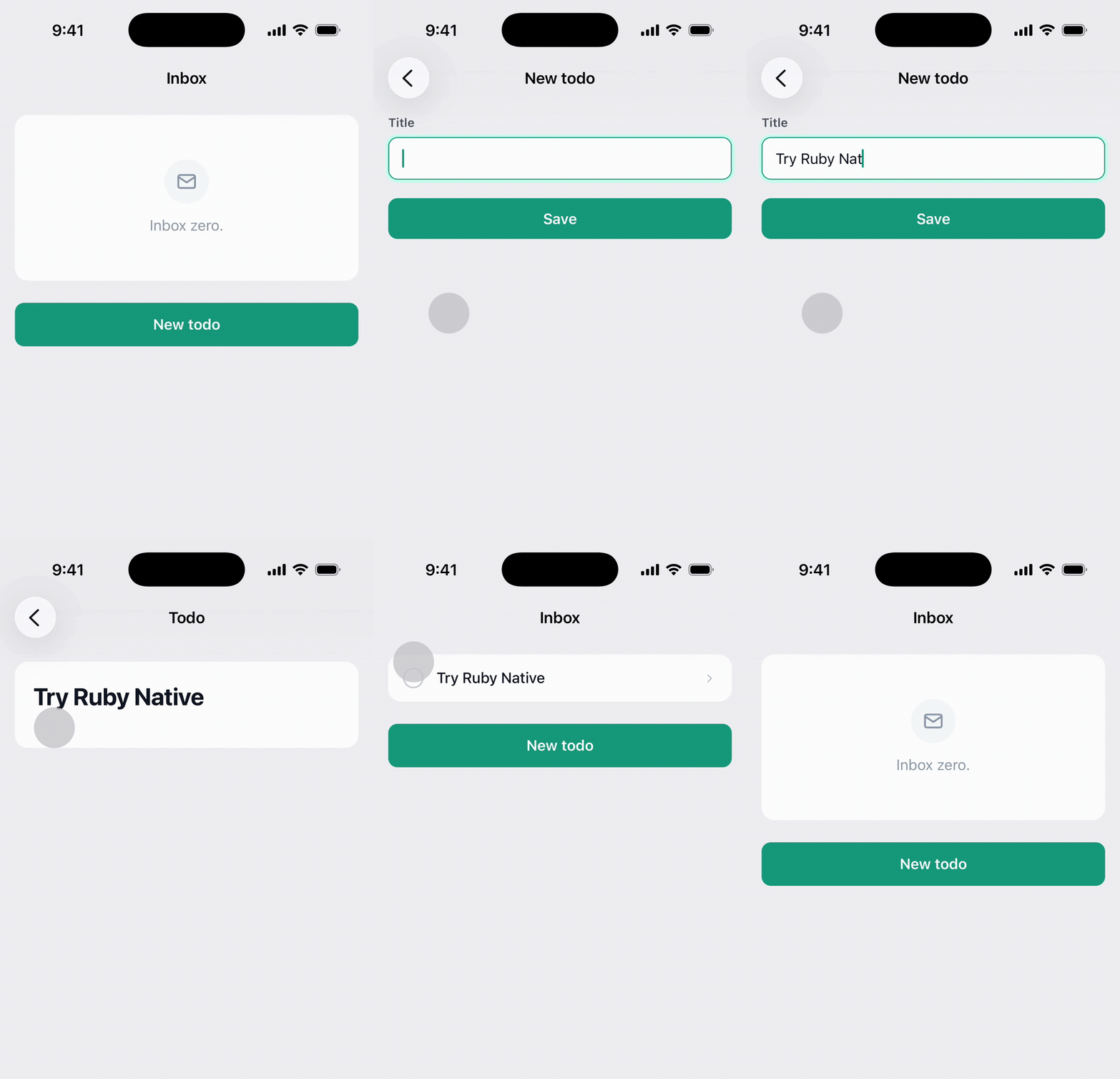
## How it works
Mark any page that contains a form. The app records it as a form page and skips over it when navigating back. Add this to every form page: new, edit, sign in, sign up, and any other page with a form submission.
Signal elements must be in the ``, not the ``. The app detects them via a MutationObserver on the body element.
## Usage
**ERB:**
```erb
<%# app/views/links/new.html.erb %>
<%= native_form_tag %>
New link
<%= render "form", link: @link %>
```
**React:**
Set `@native_form = true` in your controller action. The `InertiaSupport` concern shares it automatically as `nativeForm`.
```ruby
# app/controllers/habits_controller.rb
def new
@native_form = true
render inertia: "Habits/New", props: { habit: Habit.new }
end
```
Then render the `NativeForm` component on form pages:
```jsx
import { NativeForm } from "@ruby-native/react"
export default function New({ habit, errors }) {
return (
<>
)
}
```
**Vue:**
Set `@native_form = true` in your controller action. The `InertiaSupport` concern shares it automatically as `nativeForm`.
```ruby
# app/controllers/habits_controller.rb
def new
@native_form = true
render inertia: "Habits/New", props: { habit: Habit.new }
end
```
Then render the `NativeForm` component on form pages:
```vue
```
## Native submit button
You can also add a submit button to the [navigation bar](/docs/navbar#submit-buttons) that clicks the web form's submit button and mirrors its disabled state. See the [navbar guide](/docs/navbar#submit-buttons) for details.
--------------------------------------------------------------------------------
Page: Inertia (React & Vue)
URL: https://rubynative.com/docs/inertia
--------------------------------------------------------------------------------
# Inertia (React & Vue)
Ruby Native includes first-class support for Inertia.js apps using React or Vue. This guide covers the one-time setup. Once configured, all the feature guides (navbar, forms, badges, etc.) include Inertia examples alongside ERB.
## 1. Include the concern
Add `RubyNative::InertiaSupport` to your application controller. It shares `nativeApp` and `nativeForm` props automatically via `inertia_share`.
```ruby
# app/controllers/application_controller.rb
class ApplicationController < ActionController::Base
include RubyNative::InertiaSupport
end
```
Your own `InertiaSharedData` concern handles app-specific props (flash, current_user, etc.). The gem concern only shares what it owns.
## 2. Install the npm package
React and Vue components ship as two scoped npm packages under the Ruby Native org. Install the one that matches your frontend.
**React:**
```sh
npm install @ruby-native/react
```
**Vue:**
```sh
npm install @ruby-native/vue
```
Import the components directly in your pages and layouts.
**React:**
```jsx
import { NativeTabs, NativePush, NativePresentation } from "@ruby-native/react"
```
**Vue:**
```js
import { NativeTabs, NativePush, NativePresentation } from "@ruby-native/vue"
```
## 3. Use the `nativeApp` prop
The `InertiaSupport` concern shares a `nativeApp` boolean prop on every page. Use it to hide web-only elements when the native app is connected.
**React:**
```jsx
import { usePage } from "@inertiajs/react"
export default function Index() {
const { nativeApp } = usePage().props
return (
<>
{!nativeApp &&
Habits
}
{/* ... */}
)
}
```
**Vue:**
```vue
Habits
```
This is the Inertia equivalent of the `native_app?` helper used in ERB views.
## Feature guides
With setup complete, follow the feature guides to add native functionality. Each guide includes Inertia examples alongside ERB.
- [Setup](/docs/setup) - tabs and layout
- [Navigation bar](/docs/navbar) - native navbar with buttons, menus, and submit buttons
- [Form handling](/docs/forms) - skip form pages when navigating back
- [Back buttons](/docs/back-buttons) - native back navigation
- [Haptics](/docs/haptics) - device vibrations on user interaction
- [Badges](/docs/badges) - app icon and tab bar badges
--------------------------------------------------------------------------------
Page: Appearance
URL: https://rubynative.com/docs/appearance
--------------------------------------------------------------------------------
# Appearance
Customize your app's colors and layout in `config/ruby_native.yml`.
```yaml
appearance:
tint_color: "#007AFF"
background_color: "#FFFFFF"
```
The `tint_color` controls the active tab icon color and any tinted UI elements.
The `background_color` is used as the window background, visible during app launch and view transitions. Set it to match your CSS body background to avoid a flash of white before content loads. If omitted, the default is white.
## Theme
By default, the app follows the device's system appearance. Set `theme` to force light or dark mode regardless of the user's device setting.
```yaml
appearance:
theme: light
```
| Value | Behavior |
|---|---|
| `auto` | Follows the device setting (default) |
| `light` | Always light mode |
| `dark` | Always dark mode |
When omitted, `theme` defaults to `auto`.
## Dark mode
Color fields accept a plain hex string or an object with `light` and `dark` keys.
```yaml
appearance:
tint_color: "#007AFF"
background_color:
light: "#FFFFFF"
dark: "#212529"
```
The app picks the matching value based on the current appearance. This follows the device setting by default, or the forced `theme` if you set one. If you pass a plain string instead of an object, that color is used for both modes.
## Navbar branding
Brand the navigation bar across your whole app: a centered logo in place of the page title, your own bar colors, and a matching status bar.
```yaml
appearance:
navbar:
logo: "<%= image_url('logo.png') %>"
background_color: "#3B3F54"
foreground_color: "#FFFFFF"
status_bar: light
```
Everything in the `navbar` block is optional. Set only the colors for a themed bar with text titles, or add a logo to replace those titles.
### Logo
Set `logo` with `image_url`. `config/ruby_native.yml` is evaluated as ERB, and the fingerprinted URL means the app downloads the logo once, caches it, and re-downloads it only when the image changes.
```yaml
logo: "<%= image_url('logo.png') %>"
```
A full URL works too, for a logo hosted on a CDN.
Use a PNG (or any raster format) with a transparent background; SVGs are not supported. The logo renders about 30 pt tall with its width following the aspect ratio, so export it at roughly 3x that (around 90 to 120 px tall) and keep it a compact wordmark so it doesn't crowd the back button.
The logo replaces the page title and stays centered on every screen, including during the native push and pop transitions in [Advanced Mode](/docs/advanced-mode). Leading and trailing [buttons](/docs/navbar#buttons) added with `native_navbar_tag` still appear as usual.
### Bar colors
`background_color` sets the bar's background, and `foreground_color` sets the title and bar button color. Each accepts a hex string or a `{ light:, dark: }` object, like the [dark mode](#dark-mode) colors above.
### Status bar
Set `status_bar` to keep the clock and system icons readable against your bar: `light` for white content on a dark bar, `dark` for dark content on a light bar. Omit it to let the system decide; it is not derived from your bar color.
## Splash screen
On iOS, show the launch screen with an activity indicator while the app loads, instead of flashing to a blank web view. Set `enabled: true` to turn it on.
Android needs no additional configuration. The system splash screen and your icon on your background color always remain visible until the first page renders.
```yaml
appearance:
splash:
enabled: true
spinner_color: "#007AFF"
status_bar: light
```
Everything except `enabled` is optional:
- `spinner_color` sets the color of the activity indicator. By default it picks black or white from your `background_color` so it stays visible; override it with your own color, such as a brand accent. Accepts a hex string or a `{ light:, dark: }` object, like the [dark mode](#dark-mode) colors above.
- `status_bar` sets the status bar content over the splash: `light` for white content on a dark background, `dark` for dark content on a light one. By default it is chosen to stay readable against your `background_color`.
The splash shows on every launch except the very first after install, when your config hasn't been cached yet.
Android doesn't read this block. It always shows the system splash screen, holding your launch icon on your `background_color` until the first screen paints, so there's nothing to enable and no spinner to color.
## Edge-to-edge content
The web view always extends behind the status bar and Dynamic Island. Your web page controls the entire screen, including the area behind system UI.
Add `viewport-fit=cover` to your viewport meta tag so CSS `env(safe-area-inset-*)` variables return real values.
```erb
```
### Safe area CSS classes
The gem stylesheet provides utility classes to add safe area spacing. These stack with your existing padding and margin utilities.
```erb
<%= stylesheet_link_tag :ruby_native %>
```
| Class | Effect |
|---|---|
| `native-inset` | Adds safe area spacing at top and bottom |
| `native-inset-top` | Adds safe area spacing at top only |
| `native-inset-bottom` | Adds safe area spacing at bottom only |
```erb
<%= yield %>
```
These classes use `::before` and `::after` pseudo-elements, so they stack with padding utilities like `pb-8` without conflicting. Background colors extend through the inset area.
### Fixed navbars
For `position: fixed` navbars, use `native-inset-top` directly on the navbar element. The navbar background extends behind the status bar while its content is pushed below the Dynamic Island.
```erb
```
The content area below a fixed navbar still needs its own top padding to clear the navbar, plus `native-inset-top` for the safe area.
### Fixed overlays
Navbars pinned to `top: 0` can use `native-inset-top` because the spacer pushes their content down. Overlays anchored at an offset can't: a banner at `top: 0.75rem` or a toast stack near the top of the screen needs the offset itself to account for the safe area. Anchor these with `max()` and the gem's safe area variables:
```css
.banner {
position: fixed;
top: max(0.75rem, calc(var(--ruby-native-safe-area-top) + 0.5rem));
}
```
Or inline with Tailwind:
```erb
```
The same applies to full-screen modals: give the modal container `padding-top: max(0.75rem, var(--ruby-native-safe-area-top))` so its header and close button sit below the status bar.
`--ruby-native-safe-area-top` and `--ruby-native-safe-area-bottom` come from the gem stylesheet and resolve everywhere. On iOS they read `env(safe-area-inset-top)`, on Android the app pushes in the real system bar heights, and on the web they fall back to `0px`, so they're safe in CSS that also serves your website.
Don't use raw `env(safe-area-inset-*)` for these rules. Android's WebView doesn't populate it from system bars, so an overlay that looks right on iOS silently sits under the Android status bar.
## Landscape orientation
By default, apps run in portrait only on phones. Set `landscape: true` to let phones rotate into landscape left and landscape right as well.
```yaml
appearance:
landscape: true
```
| Value | Behavior on phones |
|---|---|
| `false` or omitted | Portrait only (default) |
| `true` | Portrait, landscape left, and landscape right |
Tablets always rotate freely, regardless of this setting. iPads and newer Android tablets ignore orientation locks at the system level, so locking would only apply to older Android tablets and split behavior by OS version.
Make sure your layouts work at landscape widths before enabling this, and at tablet widths if you support tablets. Test fixed-width elements, full-height sections, and any CSS that assumes a narrow viewport.
--------------------------------------------------------------------------------
Page: Error screen
URL: https://rubynative.com/docs/error-screen
--------------------------------------------------------------------------------
# Error screen
When the app fails to load a page it shows a native screen with an icon, a short message, and a retry button.
You can customize the icon and copy and translate the copy into any language your app supports. Customize only what you want to change to override the English defaults.
## The two types of errors
| Type | When it shows |
|---|---|
| `offline` | The device has no network connection: airplane mode or no signal |
| `generic` | Any other failure to load: a 500 response, an unreachable server, or a request time out |
## Error messages
Title and message copy lives in your app's own locale files, under the `ruby_native` namespace. This reuses the I18n setup you already have, so error copy sits alongside the rest of your app's strings.
```yaml
# config/locales/en.yml
en:
ruby_native:
errors:
retry: "Retry"
offline:
title: "You're offline"
message: "Check your connection and try again."
generic:
title: "Something went wrong"
message: "Please try again in a moment."
```
The `retry` label is shared by both states.
## Icons
Set [per-state icons](/docs/icons) in `config/ruby_native.yml`.
```yaml
errors:
offline:
icons:
ios: wifi.slash
android: wifi_off
generic:
icons:
ios: exclamationmark.triangle
android: error_outline
```
--------------------------------------------------------------------------------
Page: Authentication
URL: https://rubynative.com/docs/authentication
--------------------------------------------------------------------------------
# Authentication
Ruby Native reuses your existing sign in and registration screens in the native app. There's no need to build separate native auth flows. Your web forms, validation, error messages, and forgot password pages all work as-is.
There are two things to get right: keeping sessions alive so native users aren't logged out unexpectedly, and telling the app who is signed in so signing out clears their screens.
If your app uses OAuth (Sign in with Google, GitHub, etc.), see the [OAuth guide](/docs/oauth).
## Rails authentication generator
If you're using the built-in Rails authentication generator, set the session cookie to permanent.
```ruby
cookies.signed.permanent[:session_id] = session.id
```
## Devise
Always remember native users by adding a hidden field to your sign-in form.
```erb
<%= form_with url: session_path do |form| %>
<% if native_app? %>
<%= form.hidden_field :remember_me, value: true %>
<% else %>
<%= form.check_box :remember_me %>
<%= form.label :remember_me %>
<% end %>
<% end %>
```
## Sign out
The native app keeps screens alive between page loads. When signing out, other tabs need their context cleared. Tell the app who is signed in with `native_identity_tag`, and it will clear everything when they sign out or switch accounts.
Render the tag on every page, even when the user is signed out:
```erb
<%= native_identity_tag current_user&.id %>
```
The value rendered with this tag is hashed using your app's `secret_key_base`, so it won't expose any information.
### Account and team switching
Pass an array to widen the identity boundary:
```erb
<%= native_identity_tag [current_user&.id, current_team&.id] %>
```
Use this when switching teams should clear the screens, not just re-render the current one.
### Behavior
The app resets when the identity is removed or changes: signing out or switching accounts. Signing in never resets, so a login reached deep in a checkout flow keeps its place.
A page that renders no tag at all changes nothing in either direction, so a template that misses the layout can never sign anyone out by accident.
### Inertia apps
The token is computed server-side so `secret_key_base` never reaches the client. Share it as a prop alongside your other shared data:
```ruby
# app/controllers/concerns/inertia_shared_data.rb
inertia_share do
{
native_identity: helpers.native_identity_token(current_user&.id),
# ...
}
end
```
Don't reach for the ERB helper here: Inertia visits never re-render the Rails layout, so an element placed there would keep the old token across a sign-out.
Attach the element in `createInertiaApp`'s `resolve` wrapper, never only in your main layout component. Auth and landing pages opt out of layouts, and a signed-out page missing the element makes sign-out invisible to the app. The React version wraps whatever layout a page chose; the Vue version leans on Inertia's nested layout arrays to do the same.
**React:**
```jsx
// app/frontend/entrypoints/inertia.jsx
import { createInertiaApp } from "@inertiajs/react"
import { createRoot } from "react-dom/client"
import Layout from "~/layouts/Layout"
const pages = import.meta.glob("../pages/**/*.jsx", { eager: true })
createInertiaApp({
resolve: (name) => {
const page = pages[`../pages/${name}.jsx`]
if (!page) throw new Error(`Page not found: ${name}`)
if (!page.default.layout?.__withIdentity) {
const layout = page.default.layout || ((page) => {page})
const wrapped = (page) => (
<>
{layout(page)}
)
wrapped.__withIdentity = true
page.default.layout = wrapped
}
return page
},
setup({ el, App, props }) {
createRoot(el).render()
},
})
```
**Vue:**
```js
// app/frontend/entrypoints/inertia.js
import { createApp, h, Fragment } from "vue"
import { createInertiaApp, usePage } from "@inertiajs/vue3"
import Layout from "~/layouts/Layout.vue"
const pages = import.meta.glob("../pages/**/*.vue", { eager: true })
const IdentityLayout = {
setup(_, { slots }) {
const page = usePage()
return () => h(Fragment, [
h("div", { "data-native-identity": page.props.native_identity ?? "", hidden: true }),
slots.default ? slots.default() : null,
])
},
}
createInertiaApp({
resolve: (name) => {
const page = pages[`../pages/${name}.vue`]
if (!page) throw new Error(`Page not found: ${name}`)
const existing = page.default.layout || Layout
const layouts = Array.isArray(existing) ? existing : [existing]
if (layouts[0] !== IdentityLayout) {
page.default.layout = [IdentityLayout, ...layouts]
}
return page
},
setup({ el, App, props, plugin }) {
createApp({ render: () => h(App, props) })
.use(plugin)
.mount(el)
},
})
```
`NativeIdentity` from `@ruby-native/react` and `@ruby-native/vue` renders the same element when a component is more convenient, but the wrapper is what guarantees every page carries one.
--------------------------------------------------------------------------------
Page: OAuth
URL: https://rubynative.com/docs/oauth
--------------------------------------------------------------------------------
# OAuth
Ruby Native handles the complete client-side OAuth flow for Sign in with Google, GitHub, and other providers. Users sign in through a secure system browser, and the app captures the session automatically. No extra code needed beyond configuration.
Ruby Native hooks into your existing OAuth implementation. You still set up the provider credentials, OmniAuth strategy, and callback handling in your Rails app as usual. Ruby Native only handles the native side: opening the browser sheet, capturing the session, and returning the user to the app.
## Configuration
Add an `auth` section to `config/ruby_native.yml` listing every path that starts an OAuth flow:
```yaml
auth:
oauth_paths:
- /auth/google_oauth2
- /auth/github
- /auth/apple
```
These should match the paths your OAuth library uses. For OmniAuth, it's typically `/auth/{provider}`. Each provider uses the same flow.
That's it. The gem and the native app handle everything else.
## What the user sees
1. The user taps "Sign in with Google" (or another provider) in your app.
2. A system browser sheet slides up with the provider's sign-in page.
3. The user picks an account or enters their credentials.
4. The browser sheet closes and they land on the logged-in page inside the app.
Your existing sign-in buttons, links, and views all work as-is. The native app detects the OAuth flow and handles the browser sheet automatically.
## Auth failures
If the user cancels or the provider returns an error, the browser sheet closes and the app stays on the sign-in page. No crash, no broken state.
--------------------------------------------------------------------------------
Page: Linked domains
URL: https://rubynative.com/docs/linked-domains
--------------------------------------------------------------------------------
# Linked domains
Linking your domain to the app makes the website and the app act like the same thing. Tap a link to your site in Messages or Gmail and it opens in your app instead of the browser. Sign in to your site in a browser and the password autofills the next time the app prompts for it. Apple calls these features Universal Links and Shared Web Credentials, behind a single iOS entitlement called Associated Domains. Google calls them App Links and credential sharing.
## iOS
Add an `ios` section to `config/ruby_native.yml` with the same bundle ID and team ID you entered during Apple onboarding in the Ruby Native dashboard:
```yaml
ios:
bundle_id: com.example.myapp
team_id: ABCD123456
```
That's it. The gem serves `/.well-known/apple-app-site-association` automatically, and the build pipeline includes the Associated Domains entitlement in every iOS build.
## Android
Add an `android` section with your application ID and the SHA-256 fingerprint of your app signing key. Find the fingerprint in [Play Console](https://play.google.com/console) under **Setup → App integrity → App signing key certificate**:
```yaml
android:
package: com.example.myapp
cert_fingerprint: "AA:BB:CC:DD:EE:FF:00:11:22:33:44:55:66:77:88:99:AA:BB:CC:DD:EE:FF:00:11:22:33:44:55:66:77:88:99"
```
The gem serves `/.well-known/assetlinks.json` automatically, and every Android build registers your domain for App Links. Deploy the config change to production, then trigger a build: Android checks the file when the app is installed or updated, so the file needs to be live before users install.
Use the app signing key fingerprint, not the upload key. With Play App Signing, Google signs what users download, so that's the certificate Android verifies against.
## Linking specific paths
By default every URL on your domain opens the app. To link only part of your site, list path prefixes in `linked_paths`:
```yaml
linked_paths:
- /pair/
```
Links matching a prefix open the app; everything else keeps opening in the browser. Useful when the app covers a slice of the product and your emails link to pages the app doesn't show.
iOS picks the change up on your next deploy (plus Apple's propagation delay below). Android bakes the list into the app at build time, so deploy the config change first, then ship a new build.
## What the user sees
- They tap a link to your site in another app (Messages, Gmail, Notes, etc.) or scan a QR code with their camera. Your app opens directly to that URL instead of the browser.
- They sign in once on your website, then install your app. When the app shows a sign-in form, the saved password is offered above the keyboard.
No changes to your Rails app are required for either behavior. The native app handles routing the URL into your existing web views.
## Propagation delay
Apple aggressively caches the `apple-app-site-association` file via their CDN. After you ship the first build with the entitlement, Apple can take up to 24 hours to fetch and propagate the file. Subsequent changes (adding new domains, etc.) face the same delay.
In practice this means: the very first time a user installs your app from TestFlight or the App Store, linked domains may not work for a few hours. Once Apple has cached the file, everything is instant.
Android has no CDN in the middle. Each device verifies `assetlinks.json` directly when it installs or updates the app, so a live file plus a fresh install is enough.
## Multiple domains
The gem serves both files at whatever URL your Rails app is running at. If your marketing site is at `example.com` and your app is at `app.example.com`, only the latter gets linked. Both Apple and Google look for the file at the exact host.
If you want both domains linked on iOS, the cleanest fix is to serve a copy of the AASA file from your marketing site at `example.com/.well-known/apple-app-site-association`. The contents can be identical to what the gem serves. On Android the app registers only the host it was built with, so extra domains open in the browser.
## Reference
- Apple: [Supporting associated domains](https://developer.apple.com/documentation/xcode/supporting-associated-domains)
- Apple: [Allowing apps and websites to link to your content](https://developer.apple.com/documentation/xcode/allowing-apps-and-websites-to-link-to-your-content)
- Google: [Verify Android App Links](https://developer.android.com/training/app-links/verify-android-applinks)
--------------------------------------------------------------------------------
Page: Back buttons
URL: https://rubynative.com/docs/back-buttons
--------------------------------------------------------------------------------
# Back buttons
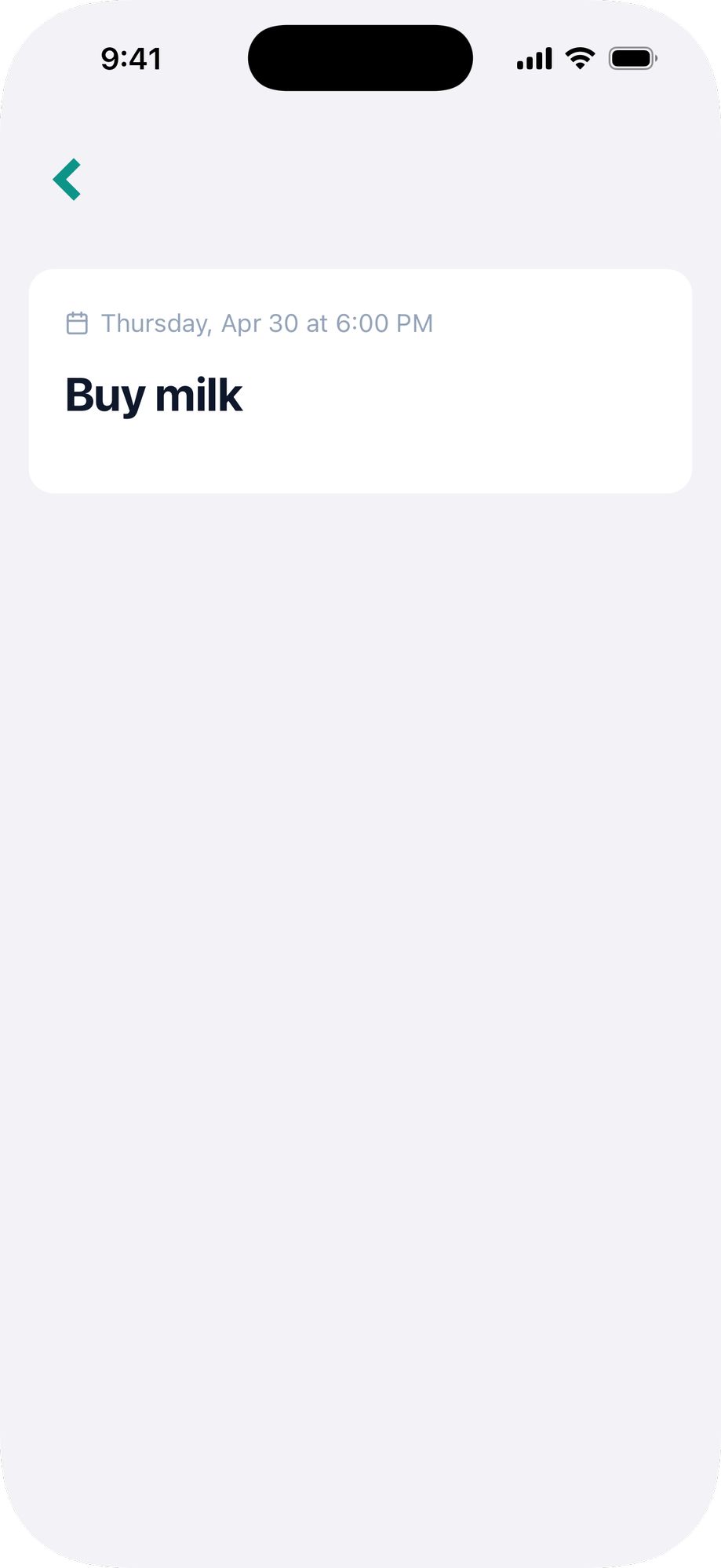
Ruby Native can show a back button when there is navigation history. The gem ships a small CSS file that handles showing and hiding the button automatically.
> **We recommend using the [native navigation bar](/docs/navbar) instead.** The native navbar handles back navigation automatically, gives you a system-styled back button on every pushed screen, and supports buttons, menus, and submit buttons out of the box. Reach for `native_back_button_tag` only if you're keeping a fully custom web header.
## Setup
Add the gem's stylesheet to your layout ``:
```erb
<%= stylesheet_link_tag :ruby_native, "data-turbo-track": "reload" %>
```
## Usage
Use the `native_back_button_tag` helper wherever you want the back button to appear:
```erb
<%= native_back_button_tag %>
```
The button is hidden by default and only shows when there is somewhere to go back to. Place it in your navbar and it appears automatically.
Pass custom text and HTML options:
```erb
<%= native_back_button_tag "Go back", class: "btn btn-link" %>
```
## Inertia (React & Vue)
Use the `NativeBackButton` component. It carries the `native-back-button` class, which the gem's stylesheet hides by default and shows when there is history to go back to. With no children it renders the same chevron as the ERB helper; pass children for your own label.
**React:**
```jsx
import { NativeBackButton } from "@ruby-native/react"
{/* Or with your own label and classes */}
Back
```
**Vue:**
```vue
Back
```
Extra attributes pass through to the underlying `