Floating action button
Add a native floating action button (FAB) for a primary action on the page, like "new post" or "compose message". It sits above the tab bar, or at the bottom safe area in apps without one, and it goes away while the keyboard is open so it never covers what you are typing into.
On iOS 26+, the button renders with Liquid Glass styling. Older versions fall back to a bordered button. On Android it renders as a standard Material 3 FAB.
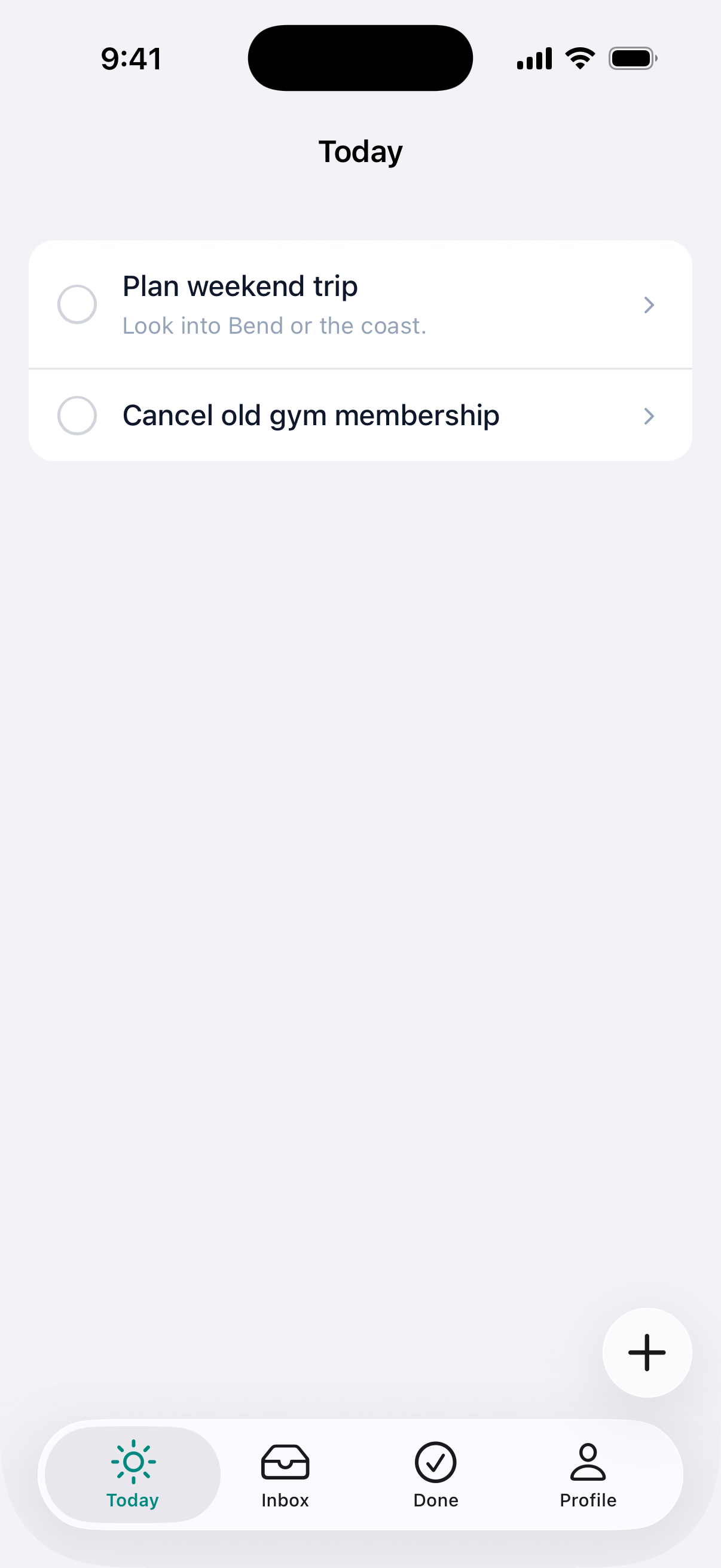
#Basic usage
Add native_fab_tag to any page that should show a floating button. The button is hidden on pages without the signal.
<%# app/views/posts/index.html.erb %>
<%= native_fab_tag(icons: { ios: "plus", android: "add" }, href: new_post_path) %>
import { NativeFab } from "@ruby-native/react"

export default function Index() {
  return <NativeFab icons={{ ios: "plus", android: "add" }} href="/posts/new" />
}
<script setup>
import { NativeFab } from "@ruby-native/vue"
</script>

<template>
  <NativeFab :icons="{ ios: 'plus', android: 'add' }" href="/posts/new" />
</template>
#Color
Pass color to accent the button. It's per page, so a destructive action can carry a different accent than a compose action.
<%= native_fab_tag(icons: { ios: "plus", android: "add" }, href: new_post_path, color: "#D97706") %>
<NativeFab icons={{ ios: "plus", android: "add" }} href="/posts/new" color="#D97706" />
<template>
  <NativeFab :icons="{ ios: 'plus', android: 'add' }" href="/posts/new" color="#D97706" />
</template>
Pass color: :tint (or color="tint" in React and Vue) to inherit your tint_color from your global appearance.
#Clicking a web element
Use click instead of href to trigger a DOM element's .click(). Useful for opening modals, firing Stimulus actions, or submitting forms owned by the web page. Keep the web element in the DOM with the native-hidden class so the native button can click it.
<%= native_fab_tag(icons: { ios: "square.and.pencil", android: "edit_square" }, click: "#compose-button") %>

<%= button_tag "Compose", id: "compose-button", class: "native-hidden",
      data: { action: "modal#open" } %>
<NativeFab icons={{ ios: "square.and.pencil", android: "edit_square" }} click="#compose-button" />

<button id="compose-button" className="native-hidden" onClick={openModal}>
  Compose
</button>
#Options
| Option | Type | Description |
|---|---|---|
icon |
string | icon name (e.g. "plus", "square.and.pencil"). Use when one name works on both platforms. Required unless icons is set. |
icons |
hash | Per-platform icons, e.g. { ios: "plus", android: "add" }. A match overrides icon. |
href |
string | URL to navigate to when tapped. |
click |
string | CSS selector of a DOM element to .click() when tapped. |
color |
string or symbol | Hex color for the button, or :tint to inherit appearance.tint_color. The icon color is derived automatically. Omit for the default look. |
Set icon or icons, at least one. icons alone is fine: on a web render the platform is unknown, so the helper falls back to icon and then to any name in icons. The signal element is hidden on the web, so which name survives there doesn't matter.
Use href or click, not both.