Toasts
A toast provides simple feedback about an operation in a small, dismissable popup. They are like flash messages in Rails, but built with native elements. In Ruby Native, they render on top of the navigation bar at the top of the screen and fire device haptics.
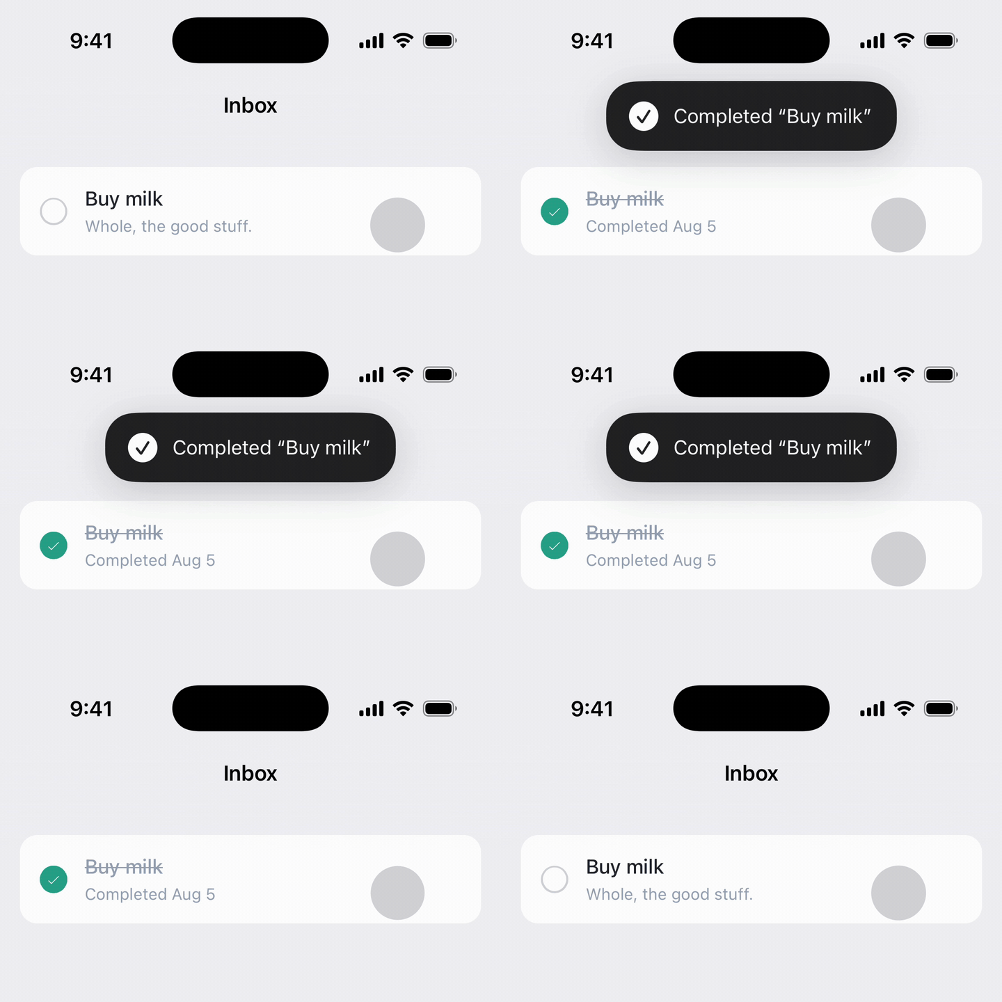
#Basic usage
Render native_toast_tag with the Rails flash in your layout, once. Every controller that redirects with notice: now toasts in the app, with no controller changes.
<%# app/views/layouts/application.html.erb %>
<%= native_toast_tag flash[:notice] %>
import { NativeToast } from "@ruby-native/react"
import { usePage } from "@inertiajs/react"

export default function Layout({ children }) {
  const { flash } = usePage().props
  return (
    <>
      <NativeToast message={flash.notice} />
      {children}
    </>
  )
}
<script setup>
import { NativeToast } from "@ruby-native/vue"
import { usePage } from "@inertiajs/vue3"

const page = usePage()
</script>

<template>
  <NativeToast :message="page.props.flash?.notice" />
  <slot />
</template>
A blank message renders nothing, so no guard is needed. The signal fires exactly once: the flash is consumed by Rails after one render, and the app consumes the signal the moment it dispatches, so navigating back to a cached page never repeats the toast.
#Keeping your web flash
In a browser the tag renders nothing visible, so web visitors keep whatever flash styling your app already has. Inside the app, don't hide the web flash entirely. Split by key instead: notices toast, alerts stay web-styled banners.
<% if native_app? %>
  <%= native_toast_tag flash[:notice] %>
  <%= render "shared/flash", flash: { alert: flash[:alert] } %>
<% else %>
  <%= render "shared/flash", flash: flash %>
<% end %>
The split matches what each message does. An alert explains the page it appears on, so "Invalid email or password" belongs next to the sign-in form where the user is looking. A notice confirms an action that already happened, so "Signed out." reads best floating over the chrome.
#Options
<%= native_toast_tag "Muted GitHub.", icons: { ios: "bell.slash.fill", android: "notifications_off" } %>
<%= native_toast_tag "Preferences saved.", icon: false, duration: 6, appearance: :system %>
icon:andicons:follow the same rules as navigation bar buttons:icon:applies everywhere,icons:overrides per platform with an SF Symbol name for iOS and a Material Symbol name for Android. The default is a platform-specific checkmark. Passicon: falsefor a text-only toast.duration:is how many seconds the toast stays up before dismissing itself. Defaults to 4 and is clamped between 1 and 30. Tapping it or swiping up dismisses it sooner.appearance:is:inverted(the default) or:system. Inverted flips the theme, so the toast is dark over a light app and light over a dark app to stand out better.
There is one toast slot. Showing a new toast replaces the current one immediately.
#Toasting from JavaScript
Client-side code can show a toast without a server round trip:
RubyNative.toast("Saved.")

RubyNative.toast({
  message: "You muted notifications for GitHub.",
  icon: "bell.slash.fill",
  duration: 6,
  appearance: "system"
})
The options match the helper's. Pass icon: false for a text-only toast. In a browser the call is a no-op, so it is safe to run unconditionally.
#Accessibility
The toast has no close button, so it takes care of itself instead: VoiceOver and TalkBack announce the message when it appears, the text scales with the user's font size, and reduced-motion settings swap the slide animation for a fade. Toasts are suppressed during App Store and Google Play screenshot runs, so one never lands in your captured screenshots.