Menus
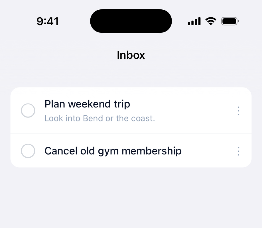
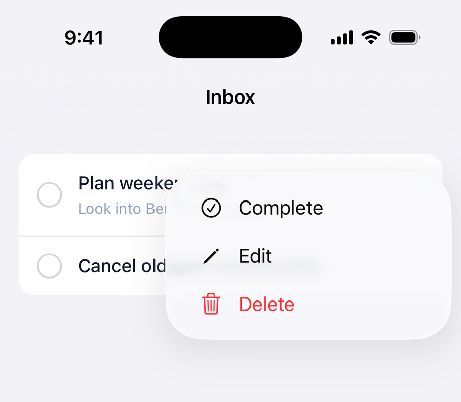
Attach a native menu to any element on the page, like a list row, a card, or a status pill. Tapping the element opens the menu anchored right on it: a native UIMenu on iOS, a Material dropdown on Android. Picking an item navigates or clicks a web element, exactly like a navigation bar menu.
#Basic usage
Wrap the items in native_menu_tag and point anchor: at a CSS selector for the element that opens it. The tag renders hidden; the anchor is an ordinary element your page already shows, like the vertical ellipsis on each row above. In a list, render one menu per record and lean on dom_id to keep the selectors unique:
<span id="<%= dom_id(todo, :menu) %>" aria-hidden="true">⋮</span>
<%= native_menu_tag anchor: "##{dom_id(todo, :menu)}" do |menu| %>
<% menu.item "Complete", click: "##{dom_id(todo, :complete)}", icons: { ios: "checkmark.circle", android: "check_circle" } %>
<% menu.item "Edit", href: edit_todo_path(todo), icons: { ios: "pencil", android: "edit" } %>
<% menu.item "Delete", click: "##{dom_id(todo, :delete)}", icons: { ios: "trash", android: "delete" }, destructive: true %>
<% end %>
<%# Keep the web elements in the DOM so the native menu can click them %>
<%= button_to "Complete", complete_todo_path(todo), method: :patch, id: dom_id(todo, :complete), form: { hidden: true } %>
<%= button_to "Delete", todo_path(todo), method: :delete, id: dom_id(todo, :delete), form: { hidden: true } %>
import { NativeMenu, NativeMenuItem } from "@ruby-native/react"
export default function TodoMenu({ todo, onComplete, onDelete }) {
return (
<>
<span id={`menu-todo-${todo.id}`} aria-hidden="true">⋮</span>
<NativeMenu anchor={`#menu-todo-${todo.id}`}>
<NativeMenuItem title="Complete" click={`#complete-todo-${todo.id}`} icons={{ ios: "checkmark.circle", android: "check_circle" }} />
<NativeMenuItem title="Edit" href={`/todos/${todo.id}/edit`} icons={{ ios: "pencil", android: "edit" }} />
<NativeMenuItem title="Delete" click={`#delete-todo-${todo.id}`} icons={{ ios: "trash", android: "delete" }} destructive />
</NativeMenu>
{/* Keep the web elements in the DOM so the native menu can click them */}
<button id={`complete-todo-${todo.id}`} onClick={onComplete} hidden>Complete</button>
<button id={`delete-todo-${todo.id}`} onClick={onDelete} hidden>Delete</button>
</>
)
}
<script setup>
import { NativeMenu, NativeMenuItem } from "@ruby-native/vue"
defineProps(["todo"])
defineEmits(["complete", "delete"])
</script>
<template>
<span :id="`menu-todo-${todo.id}`" aria-hidden="true">⋮</span>
<NativeMenu :anchor="`#menu-todo-${todo.id}`">
<NativeMenuItem title="Complete" :click="`#complete-todo-${todo.id}`" :icons="{ ios: 'checkmark.circle', android: 'check_circle' }" />
<NativeMenuItem title="Edit" :href="`/todos/${todo.id}/edit`" :icons="{ ios: 'pencil', android: 'edit' }" />
<NativeMenuItem title="Delete" :click="`#delete-todo-${todo.id}`" :icons="{ ios: 'trash', android: 'delete' }" destructive />
</NativeMenu>
<!-- Keep the web elements in the DOM so the native menu can click them -->
<button :id="`complete-todo-${todo.id}`" @click="$emit('complete')" hidden>Complete</button>
<button :id="`delete-todo-${todo.id}`" @click="$emit('delete')" hidden>Delete</button>
</template>
A page can carry several menus, each with its own anchor:. Tapping outside the menu dismisses it without running anything, and so does the system back gesture on Android. A destructive item renders red on both platforms; keep any confirmation where it belongs, on the server or in your web JavaScript.
#Menu items
Items take the same options as navigation bar menu items:
| Option | Type | Description |
|---|---|---|
title |
string | The label shown in the menu. |
href |
string | URL to navigate to when selected. |
click |
string | CSS selector of a DOM element to .click() when selected. |
icon |
string | Optional icon name shown next to the title. |
icons |
hash | Per-platform icons, e.g. { ios: "pencil", android: "edit" }. A match overrides icon. |
selected |
boolean | Renders a checkmark next to the item. |
destructive |
boolean | Renders the item red, for delete-style actions. |
action |
symbol | :replace visits href without stacking a back button, for switchers. |
Share items are the one exception: menu.share_item renders in a navbar menu but is skipped in an in-content menu, so put share actions in the navigation bar for now.