Navigation bar
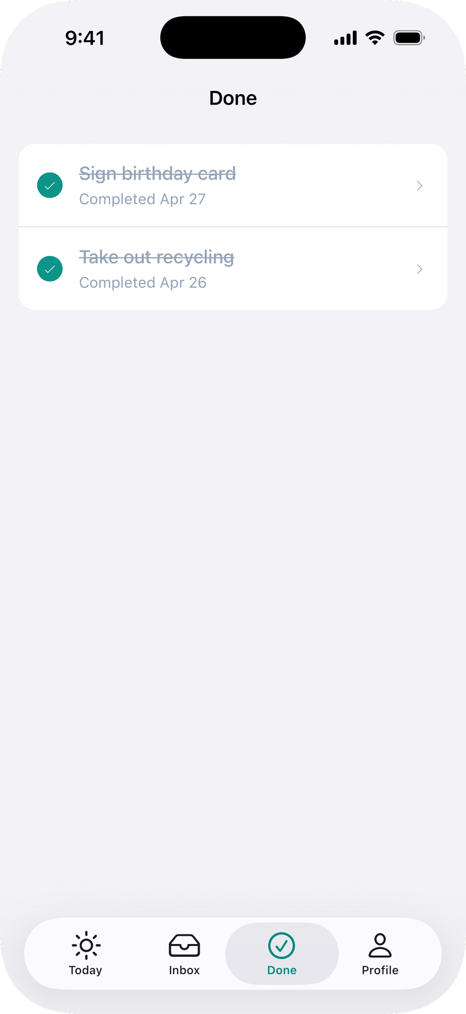
You have two options for the navigation bar: a native one provided by Ruby Native, or your own web-based one. We recommend the native navigation bar for most apps. It uses liquid glass styling, includes a back button automatically, and supports buttons, menus, submit buttons, and share buttons.
If you need full control over the navigation bar's layout and design, you can keep your web-based navbar instead. See using a web navbar below.
To put a centered logo and brand colors on the native bar across the whole app, see navbar branding.
For Inertia setup, see the Inertia guide first.
#Native navigation bar
#Basic usage
Add a navbar with a title to each page. Hide your web heading when native so the title isn't duplicated.
<%# app/views/categories/index.html.erb %>
<%= native_navbar_tag("Menu") %>

<h1 class="<%= "hidden" if native_app? %>">Menu</h1>
import { usePage } from "@inertiajs/react"
import { NativeNavbar } from "@ruby-native/react"

export default function Index() {
  const { nativeApp } = usePage().props

  return (
    <>
      <NativeNavbar title="Menu" />
      {!nativeApp && <h1>Menu</h1>}
    </>
  )
}
<script setup>
import { usePage } from "@inertiajs/vue3"
import { computed } from "vue"
import { NativeNavbar } from "@ruby-native/vue"

const page = usePage()
const nativeApp = computed(() => page.props.nativeApp)
</script>

<template>
  <NativeNavbar title="Menu" />
  <h1 v-if="!nativeApp">Menu</h1>
</template>
#Buttons
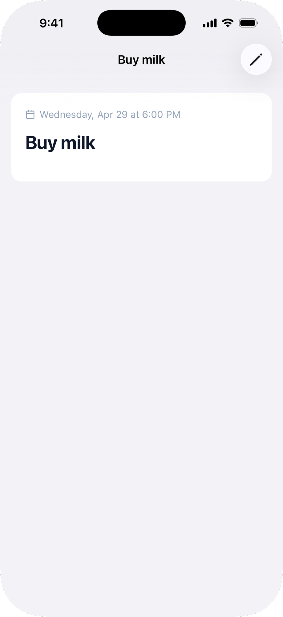
Add buttons to the navigation bar. Use href to navigate to a URL, or click to click a DOM element by CSS selector.
<%= native_navbar_tag("Menu") do |navbar| %>
  <%= navbar.button icons: { ios: "bag", android: "shopping_bag" }, href: cart_path %>
<% end %>
<NativeNavbar title="Menu">
  <NativeButton icons={{ ios: "bag", android: "shopping_bag" }} href="/cart" />
</NativeNavbar>
Builder calls work with <%= %> or <% %>; the methods collect items and render nothing inline either way. Prefer <%= %> if you run erb_lint, which flags a bare <% %> call as an unused expression.
Button options:
| Option | Type | Default | Description |
|---|---|---|---|
icon |
string | icon name (e.g., "bag", "plus", "pencil"). |
|
icons |
hash | Per-platform icons, e.g. { ios: "ellipsis.circle", android: "more_horiz" }. A match overrides icon. |
|
title |
string | Text label. Use icon or title, not both. |
|
href |
string | URL to navigate to when tapped. | |
click |
string | CSS selector of a DOM element to .click() when tapped. |
|
position |
string | "trailing" |
"trailing" (right), "leading" (left), or "title" (a dropdown on the title, see Title menu). |
selected |
boolean | false |
Renders the button in a selected/highlighted state. |
A leading button shares its slot with the back button, and the back button wins: the leading button shows on screens with nothing to go back to, like a tab's root. Put actions that should stay reachable everywhere in trailing.
#Menus
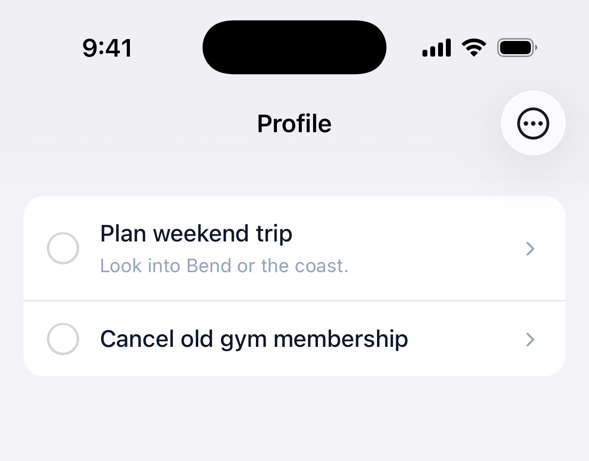
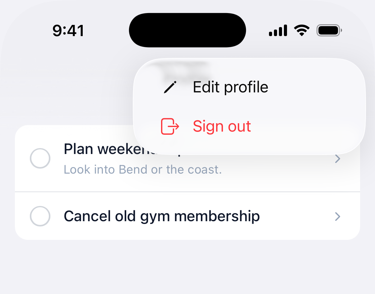
A button with children creates a dropdown menu. Each menu item uses href to navigate or click to click a DOM element.
<%= native_navbar_tag("Account") do |navbar| %>
  <%= navbar.button icons: { ios: "ellipsis.circle", android: "more_horiz" }, position: :leading do |menu| %>
    <%= menu.item "Edit profile", href: edit_account_path, icons: { ios: "pencil", android: "edit" } %>
    <%= menu.item "Sign out", click: "#sign-out-button", icons: { ios: "rectangle.portrait.and.arrow.right", android: "logout" }, destructive: true %>
  <% end %>
<% end %>

<%# Keep the web element in the DOM so the native menu can click it %>
<%= button_to "Sign out", session_path, method: :delete, id: "sign-out-button", class: "native-hidden ..." %>
<NativeNavbar title="Account">
  <NativeButton position="leading" icons={{ ios: "ellipsis.circle", android: "more_horiz" }}>
    <NativeMenuItem title="Edit profile" href="/profile/edit" icons={{ ios: "pencil", android: "edit" }} />
    <NativeMenuItem title="Sign out" click="#sign-out-button" icons={{ ios: "rectangle.portrait.and.arrow.right", android: "logout" }} destructive />
  </NativeButton>
</NativeNavbar>

{/* Keep the web element in the DOM so the native menu can click it */}
<button id="sign-out-button" onClick={handleSignOut} className="native-hidden">
  Sign out
</button>
Menu item options:
| Option | Type | Description |
|---|---|---|
title |
string | The label shown in the menu. |
href |
string | URL to navigate to when selected. |
click |
string | CSS selector of a DOM element to .click() when selected. |
icon |
string | Optional icon name shown next to the title. |
icons |
hash | Per-platform icons, e.g. { ios: "pencil", android: "edit" }. A match overrides icon. |
selected |
boolean | Renders a checkmark next to the item. |
destructive |
boolean | Renders the item red, for delete-style actions. |
action |
symbol | :replace visits href without stacking a back button, for switchers. |
Menus also work anchored to the page's own content, not just the navigation bar. See Menus.
#Title menu
Turn the title itself into a dropdown menu with position: :title. Tapping the title opens the menu, and the selected item shows a checkmark. It's the native counterpart of SwiftUI's toolbarTitleMenu, and unlike segments it works on both platforms and holds more than a handful of options, so it fits a sort or filter switcher well.
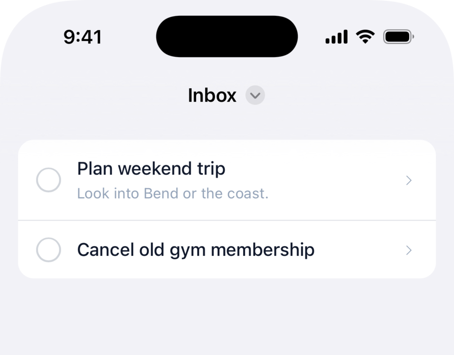
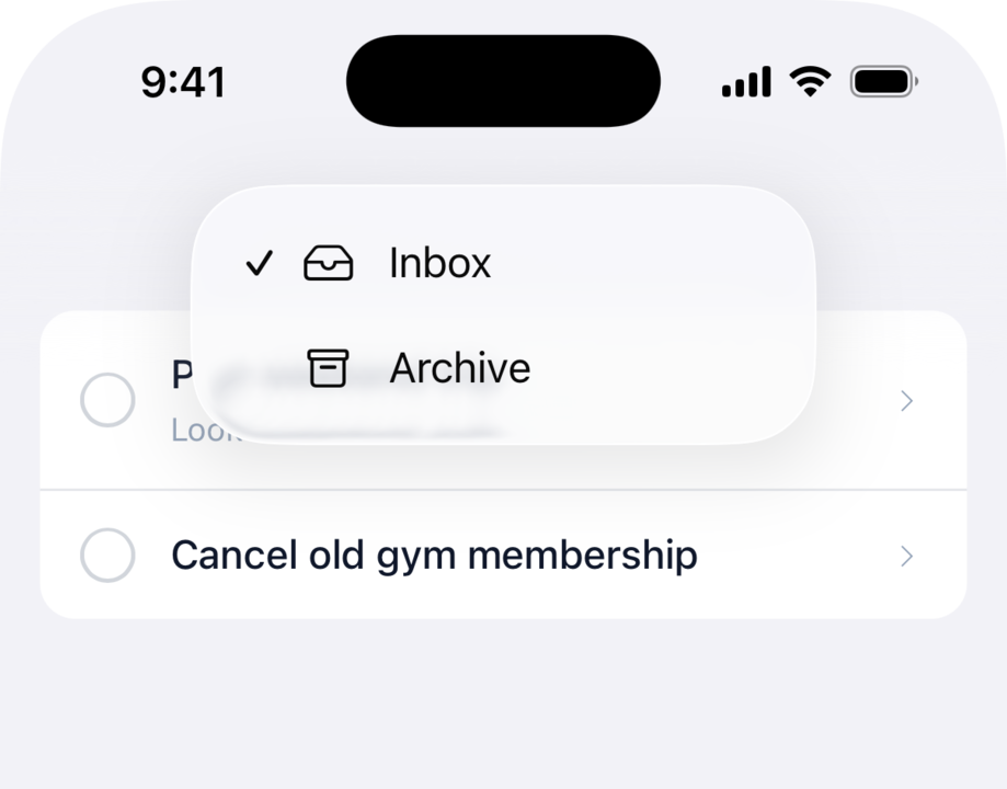
Give the button a menu and position: :title, with no icon or label of its own. Keep a title on native_navbar_tag and it stays as the label beside a dropdown chevron; omit the title and the selected item's text becomes the label. Pair the items with action: :replace so switching doesn't stack the back button, the same as segments.
<%= native_navbar_tag("Inbox") do |navbar| %>
  <%= navbar.button position: :title do |menu| %>
    <%= menu.item "Sort by due date", href: inbox_path(sort: "due"),     action: :replace, icon: "calendar", selected: @sort == "due" %>
    <%= menu.item "Sort by created",  href: inbox_path(sort: "created"), action: :replace, icon: "clock",    selected: @sort == "created" %>
  <% end %>
<% end %>
<NativeNavbar title="Inbox">
  <NativeButton position="title">
    <NativeMenuItem title="Sort by due date" href="/inbox?sort=due"     action="replace" icon="calendar" selected={sort === "due"} />
    <NativeMenuItem title="Sort by created"  href="/inbox?sort=created" action="replace" icon="clock"    selected={sort === "created"} />
  </NativeButton>
</NativeNavbar>
The items take the same menu item options as any navbar menu. A navbar logo owns the center of the bar, so when one is configured the title menu, like segments, doesn't render.
#Segments
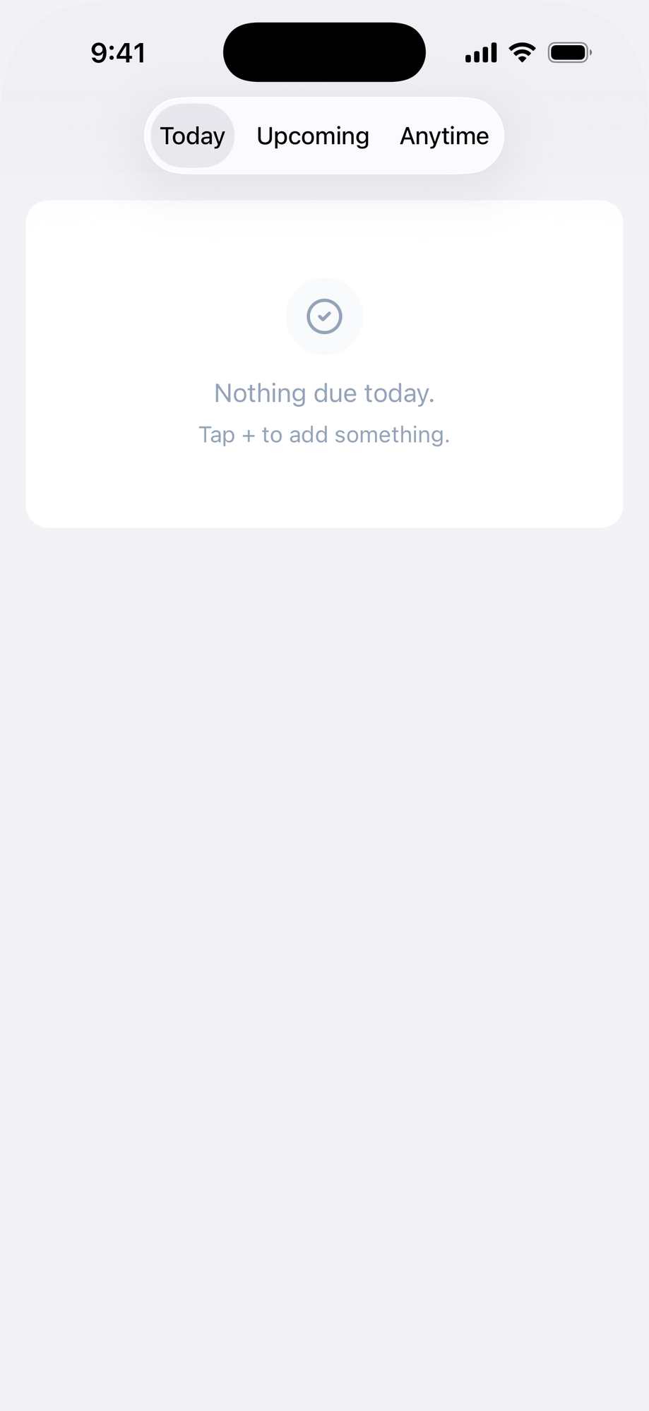
Show up to three segmented buttons at the top of the screen to switch between closely related pages. For your app's primary sections, use the bottom tab bar instead.
<%= native_navbar_tag do |navbar| %>
  <%= navbar.segment "Pledges", href: pledges_path, selected: true %>
  <%= navbar.segment "Digital Rewards", href: digital_rewards_path %>
<% end %>
<NativeNavbar>
  <NativeSegment title="Pledges" href="/pledges" selected />
  <NativeSegment title="Digital Rewards" href="/digital_rewards" />
</NativeNavbar>
Mark the current page's segment selected, and render the same set on each sibling page so the control stays in place as the user moves between them. Switching segments replaces the current history entry instead of stacking it, so the back button doesn't step back through segment switches.
Segment options:
| Option | Type | Default | Description |
|---|---|---|---|
title |
string | The segment label. First positional argument. | |
href |
string | URL to navigate to when tapped. | |
click |
string | CSS selector of a DOM element to .click() when tapped, instead of href. |
|
selected |
boolean | false |
Marks the current page's segment. |
Segments and a navbar logo both occupy the center of the bar, so when a logo is configured the segments don't render.
#Submit buttons
Add a native submit button that clicks the web form's submit button. The native button mirrors the web button's disabled state automatically, so it disables during form submission and re-enables when done.
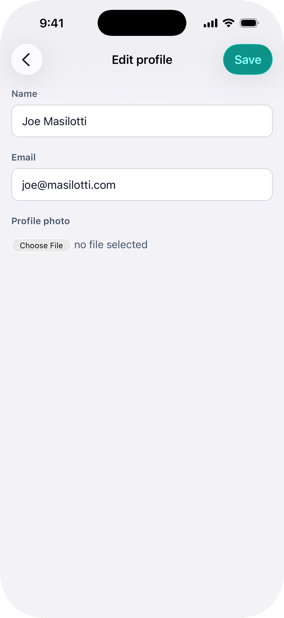
Keep the web submit button in the DOM (use the native-hidden class) so the native button can click it.
<%# app/views/accounts/edit.html.erb %>
<%= native_form_tag %>
<%= native_navbar_tag("Edit profile") do |navbar| %>
  <%= navbar.submit_button title: "Save" %>
<% end %>
import { NativeNavbar, NativeSubmitButton } from "@ruby-native/react"

export default function Edit() {
  return (
    <>
      <NativeNavbar title="Edit profile">
        <NativeSubmitButton title="Save" />
      </NativeNavbar>
      <form>
        {/* ... */}
        <button type="submit" className="native-hidden">Save</button>
      </form>
    </>
  )
}
<script setup>
import { NativeNavbar, NativeSubmitButton } from "@ruby-native/vue"
</script>

<template>
  <NativeNavbar title="Edit profile">
    <NativeSubmitButton title="Save" />
  </NativeNavbar>
  <form>
    <!-- ... -->
    <button type="submit" class="native-hidden">Save</button>
  </form>
</template>
Submit button options:
| Option | Type | Default | Description |
|---|---|---|---|
title |
string | "Save" |
The button label in the navigation bar. |
click |
string | "[type='submit']" |
CSS selector for the web submit button to click. |
#Share buttons
Add a button that opens the native share sheet. By default it shares the current page. Pass url to share a different link, and customize the label, icon, and position like any other navbar button.
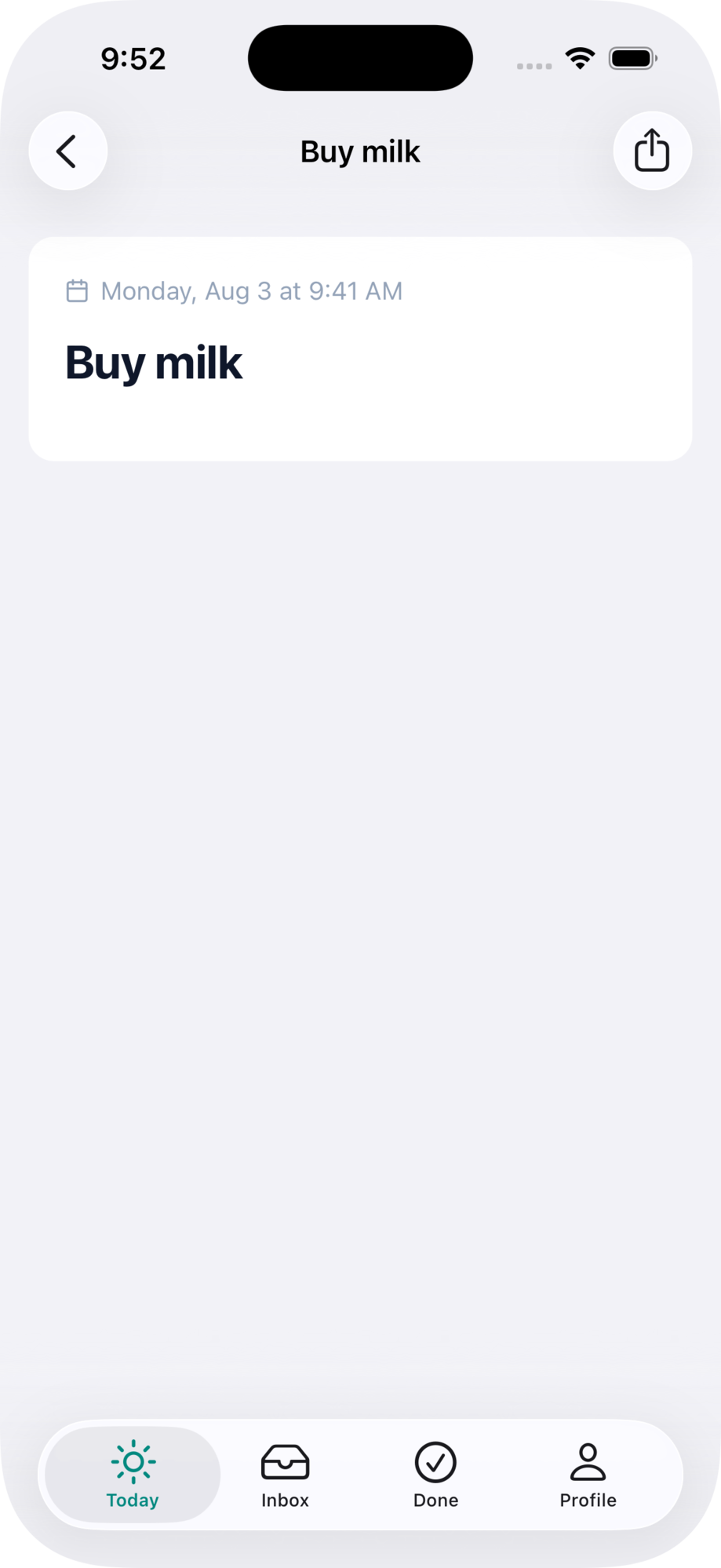
<%= native_navbar_tag("Brewery") do |navbar| %>
  <%# Shares the current page %>
  <%= navbar.share_button %>

  <%# Or customize everything %>
  <%= navbar.share_button url: brewery_url(@brewery),
                          title: "Send",
                          icons: { ios: "square.and.arrow.up.circle", android: "share" },
                          position: :leading %>
<% end %>
import { NativeNavbar, NativeShareButton } from "@ruby-native/react"

<NativeNavbar title="Brewery">
  {/* Shares the current page */}
  <NativeShareButton />

  {/* Or customize everything */}
  <NativeShareButton
    url={breweryUrl}
    title="Send"
    icons={{ ios: "square.and.arrow.up.circle", android: "share" }}
    position="leading"
  />
</NativeNavbar>
<script setup>
import { NativeNavbar, NativeShareButton } from "@ruby-native/vue"
</script>

<template>
  <NativeNavbar title="Brewery">
    <!-- Shares the current page -->
    <NativeShareButton />

    <!-- Or customize everything -->
    <NativeShareButton
      :url="breweryUrl"
      title="Send"
      :icons="{ ios: 'square.and.arrow.up.circle', android: 'share' }"
      position="leading"
    />
  </NativeNavbar>
</template>
Share button options:
| Option | Type | Default | Description |
|---|---|---|---|
url |
string | current page | The link to share. Defaults to the current page's URL. |
title |
string | "Share" |
Accessibility label. Becomes the visible text when the button has no icon. |
icon |
string | "square.and.arrow.up" |
icon name, applied to every platform. |
icons |
hash | Per-platform icons, e.g. { ios: "square.and.arrow.up", android: "share" }. A match overrides icon. |
|
position |
string | "trailing" |
"trailing" (right) or "leading" (left; the back button wins the slot on pushed screens). |
#Share from a menu
Put share inside a button's dropdown with share_item (NativeShareMenuItem in Inertia). It takes the share button's url, title, and icon/icons options, plus selected from the other menu items; action and destructive don't apply to share items.
<%= native_navbar_tag("Brewery") do |navbar| %>
  <%= navbar.button icons: { ios: "ellipsis.circle", android: "more_horiz" } do |menu| %>
    <%= menu.item "Edit", href: edit_brewery_path(@brewery) %>
    <%= menu.share_item %>
  <% end %>
<% end %>
import { NativeNavbar, NativeButton, NativeMenuItem, NativeShareMenuItem } from "@ruby-native/react"

<NativeNavbar title="Brewery">
  <NativeButton icons={{ ios: "ellipsis.circle", android: "more_horiz" }}>
    <NativeMenuItem title="Edit" href={`/breweries/${brewery.id}/edit`} />
    <NativeShareMenuItem />
  </NativeButton>
</NativeNavbar>
<script setup>
import { NativeNavbar, NativeButton, NativeMenuItem, NativeShareMenuItem } from "@ruby-native/vue"
</script>

<template>
  <NativeNavbar title="Brewery">
    <NativeButton :icons="{ ios: 'ellipsis.circle', android: 'more_horiz' }">
      <NativeMenuItem title="Edit" :href="`/breweries/${brewery.id}/edit`" />
      <NativeShareMenuItem />
    </NativeButton>
  </NativeNavbar>
</template>
#Pull to refresh
The pull-to-refresh control is installed on every page rendering a native navbar. Drag down from the top of the page and release to refresh the current URL. Turbo and Inertia pages refresh correctly because both push state on navigation and the native WebView's URL tracks that.
Pass pull_to_refresh: false to opt out on a specific page. Useful when a page has its own refresh affordance or an infinite scroll at the top that would conflict.
<%= native_navbar_tag("Map", pull_to_refresh: false) %>
<NativeNavbar title="Map" pullToRefresh={false} />
HTMX users: pull-to-refresh reloads whatever URL is in the address bar, which may not match the current view after a partial swap. Use hx-push-url="true" on the swaps you want refresh to reach, or pass pull_to_refresh: false on pages that don't push state.
#Hiding web elements
There are two ways to hide web elements when running in the native app:
native-hidden class: The element stays in the DOM but is visually hidden. Use this for elements that need to remain clickable by native buttons, menus, or submit buttons. The native-hidden class requires the gem stylesheet (<%= stylesheet_link_tag :ruby_native %>).
<%= link_to "Desktop page", desktop_path, class: "native-hidden" %>
Server-side conditional (unless native_app?): The element is not rendered at all. Use this for web-only UI that has no native equivalent, like a web navbar.
<% unless native_app? %>
  <%= render "shared/footer" %>
<% end %>
#Using a web navbar
If you need custom controls, branding, or a layout that the native navigation bar doesn't support, you can keep your web-based navbar. The native navigation bar is hidden by default, so if you don't add any native_navbar_tag or NativeNavbar signals, your web navbar will show as-is.
#Make it sticky
Pin your web navbar to the top of the screen so it stays visible as users scroll.
<nav class="fixed top-0 left-0 right-0 z-10">
  <%# your navbar content %>
</nav>
Use fixed top-0 (Tailwind) or fixed-top (Bootstrap) on your navbar element.
#Safe area padding
Add native-inset-top to your fixed navbar element so its content clears the Dynamic Island. The navbar background extends behind the status bar automatically.
See the appearance guide for safe area classes and layout details.